| CHEF’N PRODUCT PHOTOGRAPHY FOR PACKAGING | Art Direction & Graphic Design
CLIENT: Chef’n DTC customers, Retailers, Wholesalers, and Amazon
ROLE: Art Director & Graphic Design
DELIVERABLES: Packaging artwork ready for print, compliance-approved photography, and asset families that scaled across SKUs. This ensures consistency from studio to shelf and across online and offline environments
TEAM: Producer: Shelley McCracken, Photographer: Ryan Castoldi, Model: Carly Hood
PROCESS: Directing Chef’n in-studio shoots for various packaging artwork needs, product instructions, and display images intended for packaging hang cards, boxes, inserts, and CDUs.
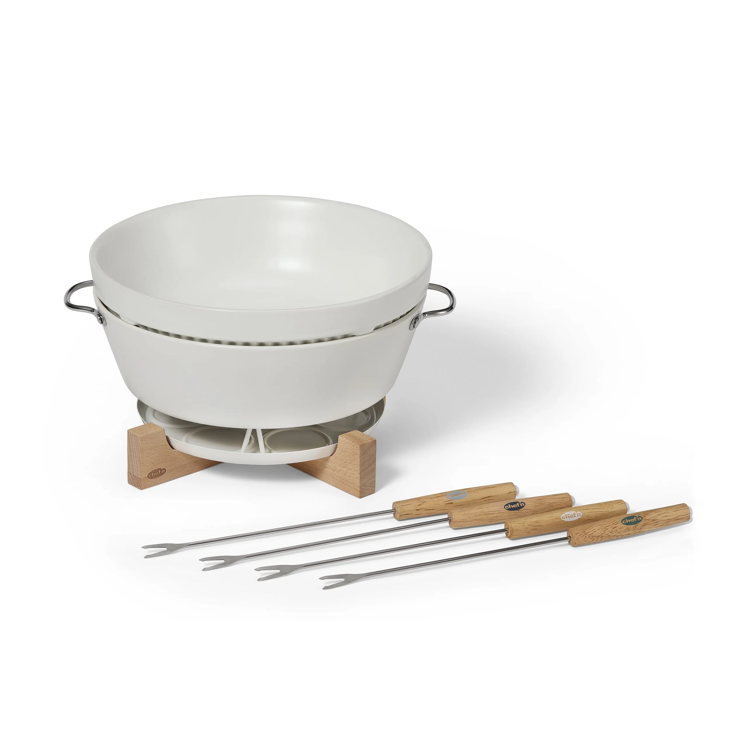
Sweet Spot Fondue Set


Working closely with the copy and compliance team, directions on how to use the product were created.
From there I create a shotlist that includes all images needed. On top of the normal information such as angle, written description, props, and estimated time. I also included “in-use” references — showing hands interacting with the product — so the photographer and talent could visualize what the image needed to communicate. This keeps the shoot efficient and aligned with both design goals and production realities.
One of my key visual priorities was hierarchy — making sure the product identity, use case, and packaging cues read clearly at first glance. That means lighting choices that highlight the product surfaces, framing that preserves legibility, and compositions that avoid visual clutter. These decisions support scan-ability, which is crucial in both e-commerce and retail environments.
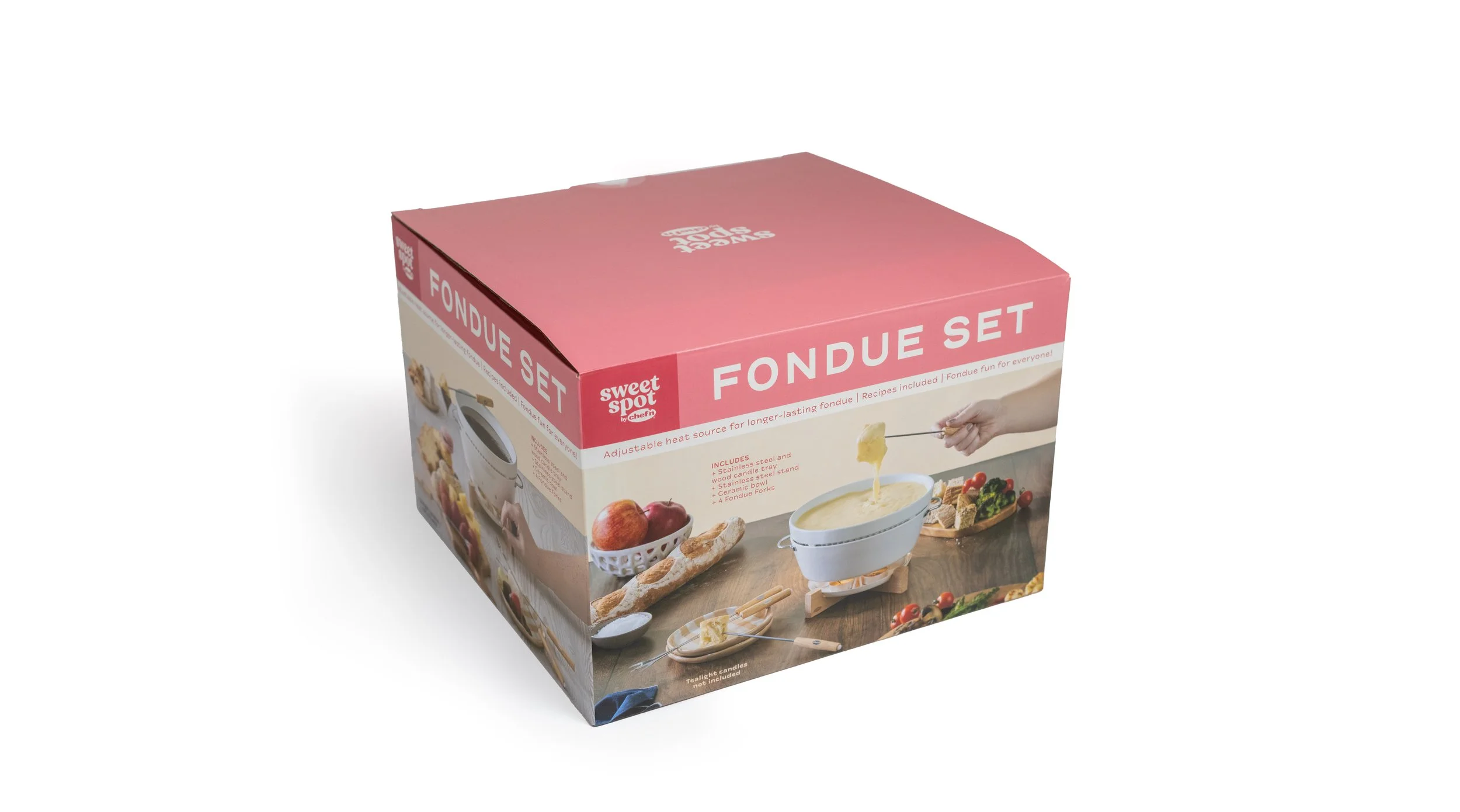
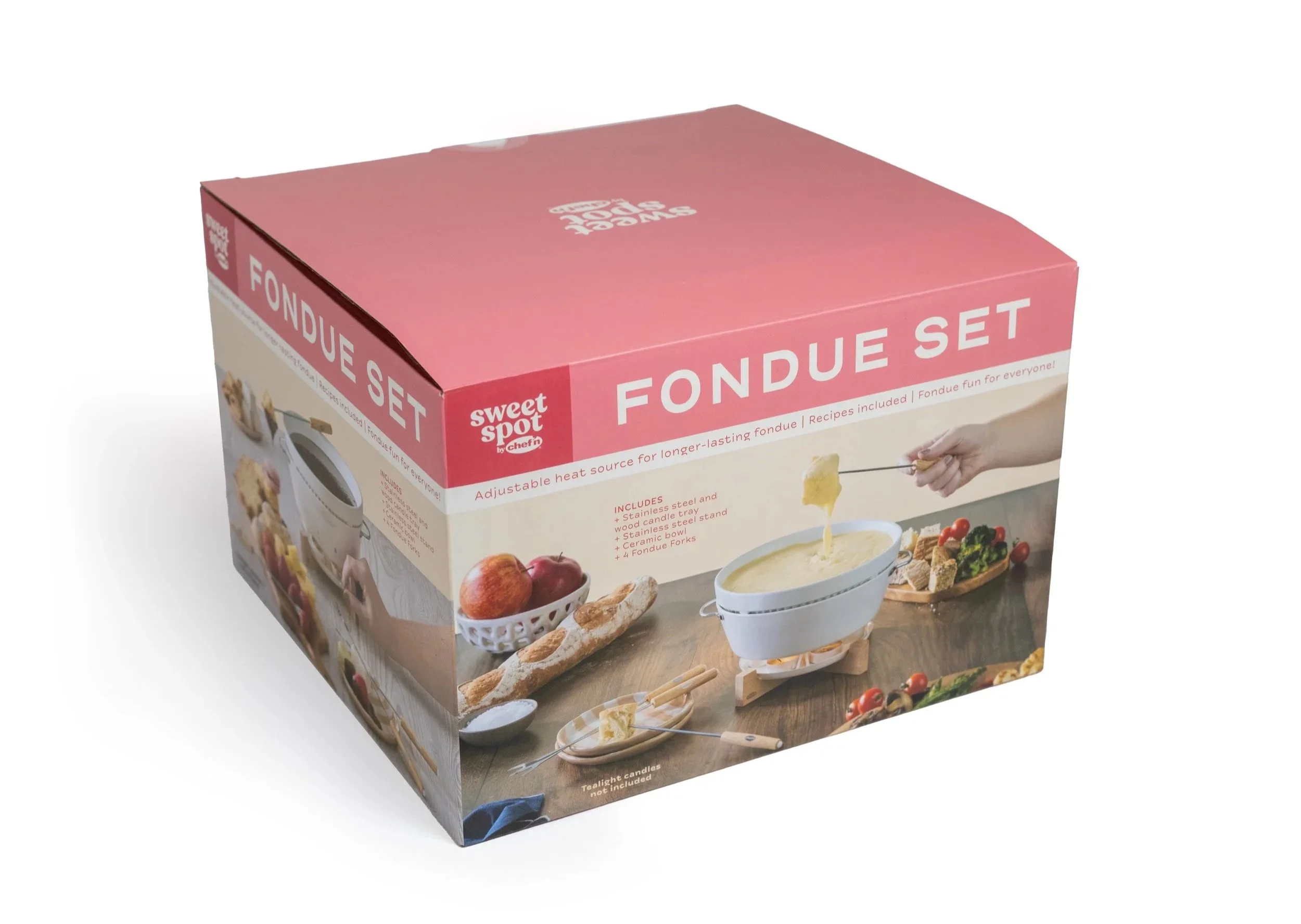
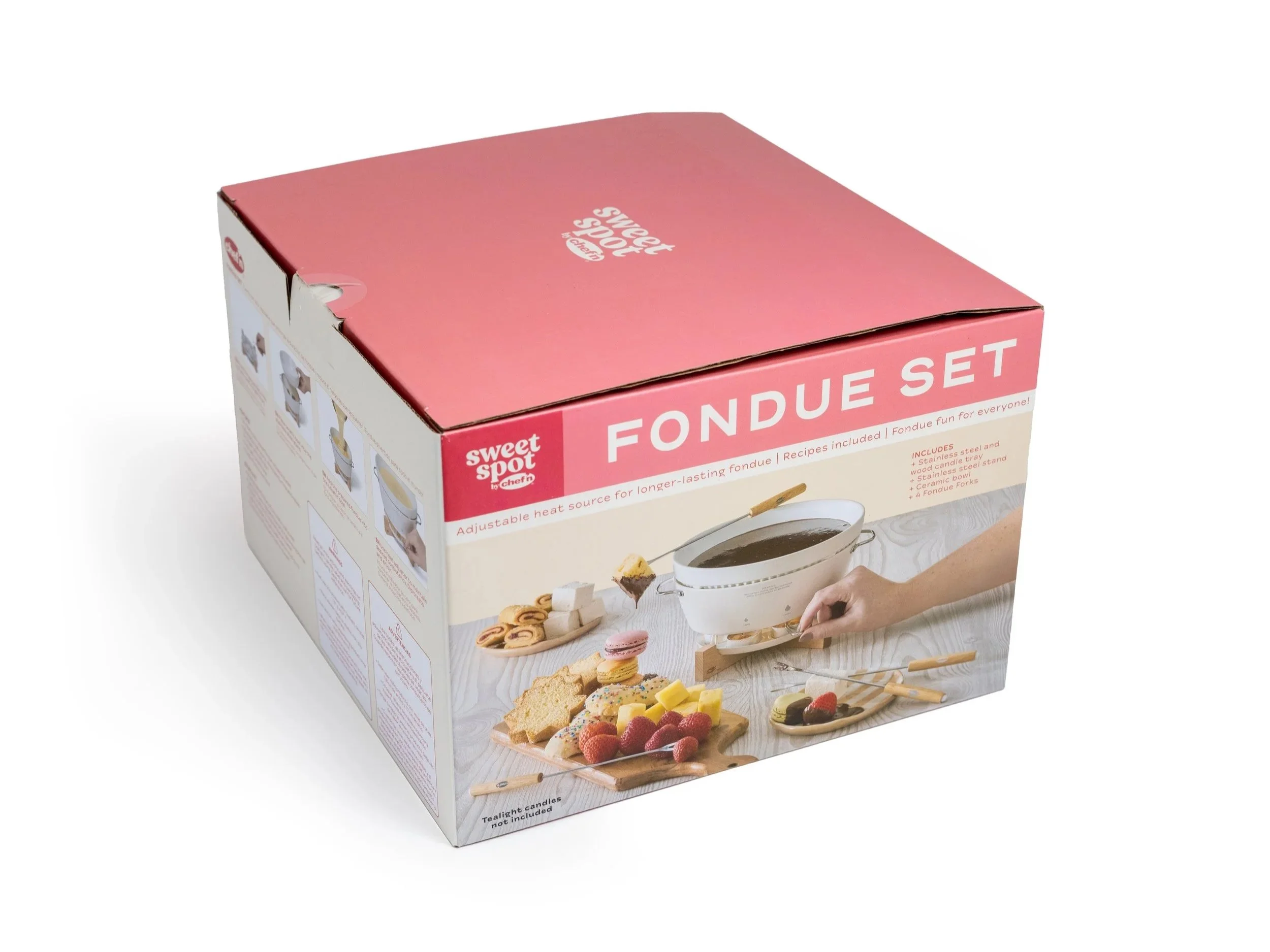
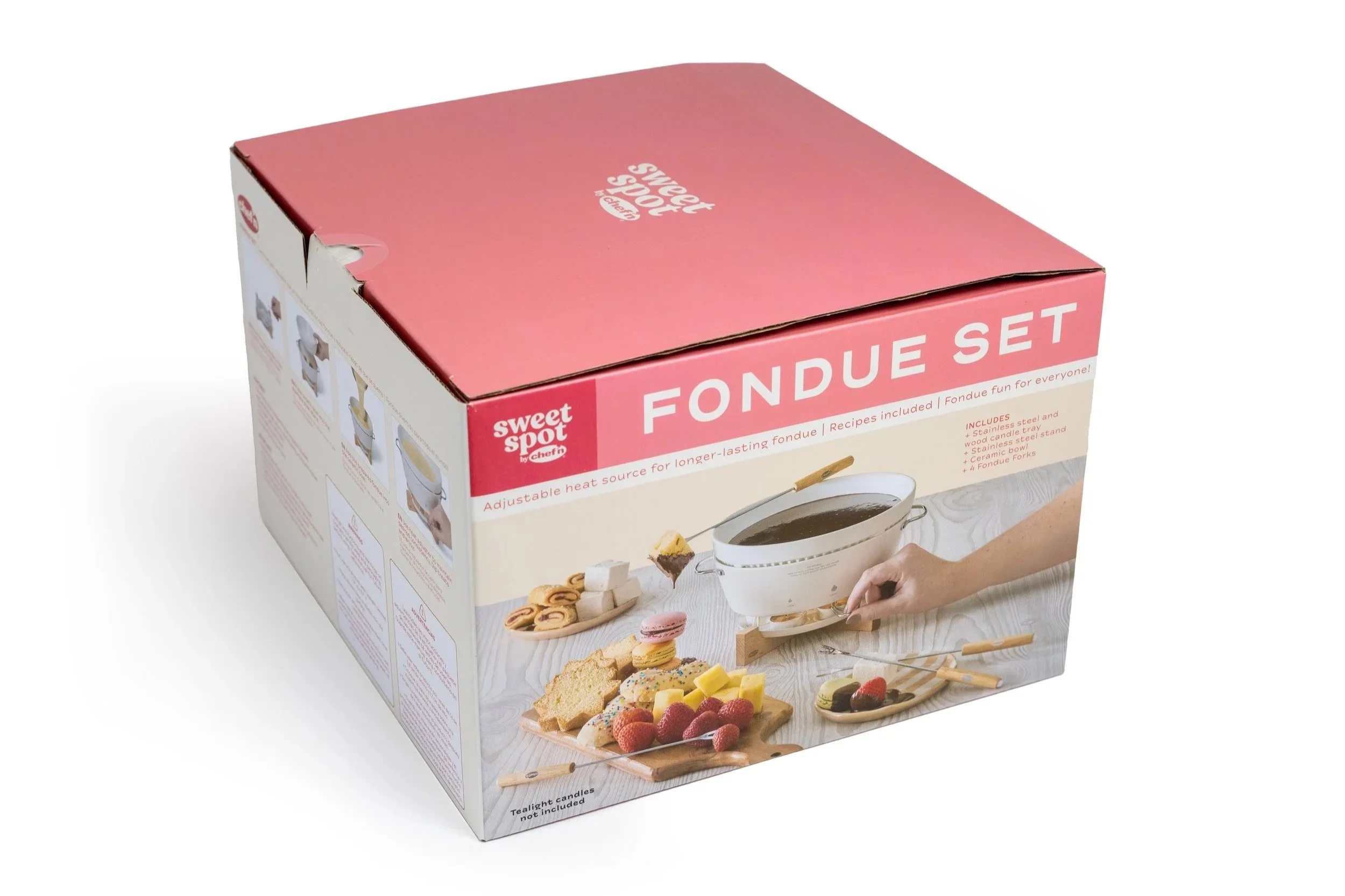
SweetSpot by Chef’n is a more higher-end and giftable product line compared to the baseline Chef’n brand. With that in mind, packaging when displayed would have two “fronts” so depending upon the holiday, cheese or chocolate could be showcased.
Packaging Images and Dielines


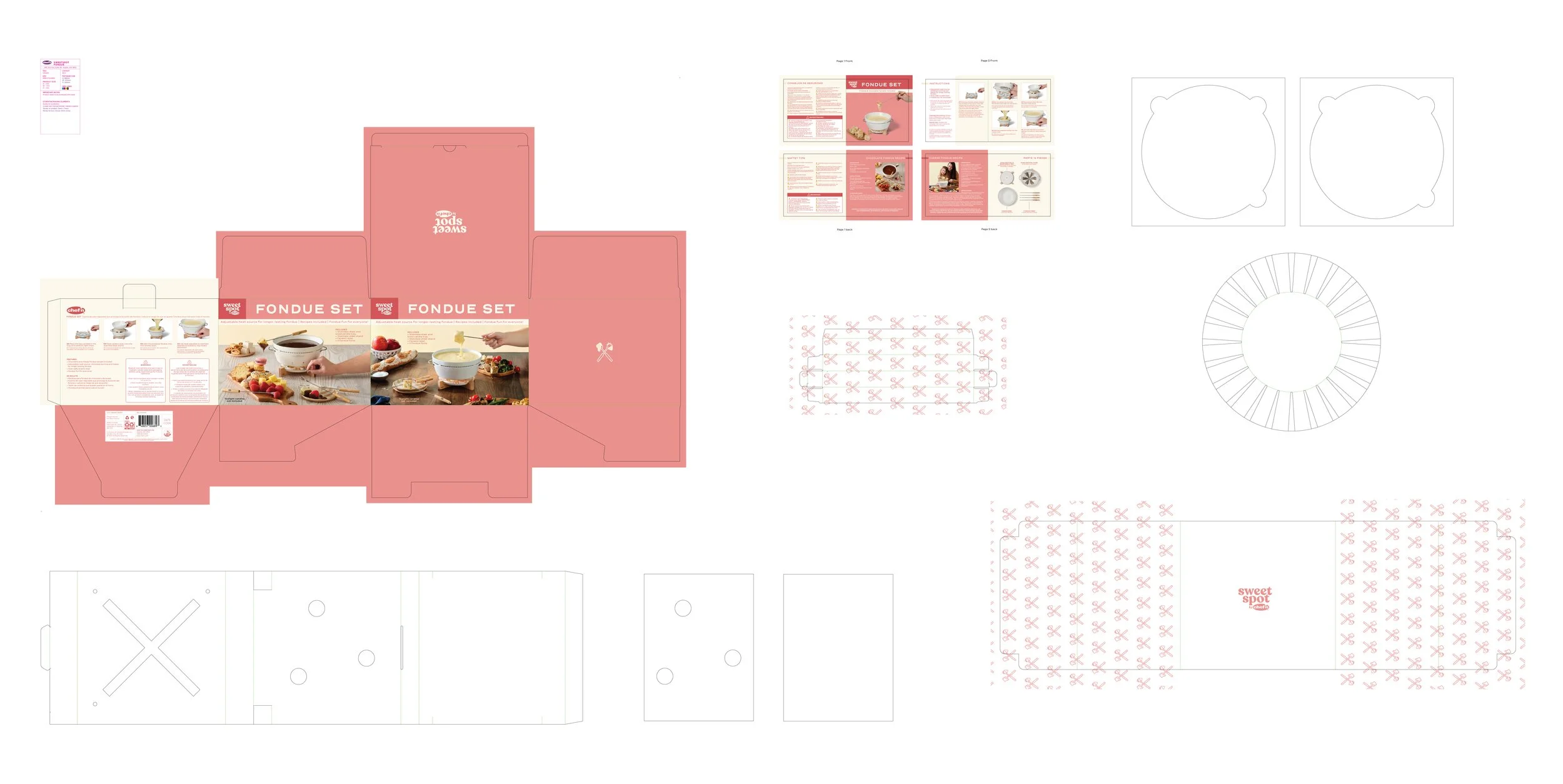
Fun but Functional Choices - Internally, I pushed for a repeating pattern on the packaging flaps. Initially, not everyone saw the value, but I tied it back to brand experience — elevating the unboxing moment without adding costly print layers. Ultimately, we executed it in a single color to balance cost and design impact.
Photography that tells a story
Images for packaging directions and insert


Lifestyle images for packaging box and insert
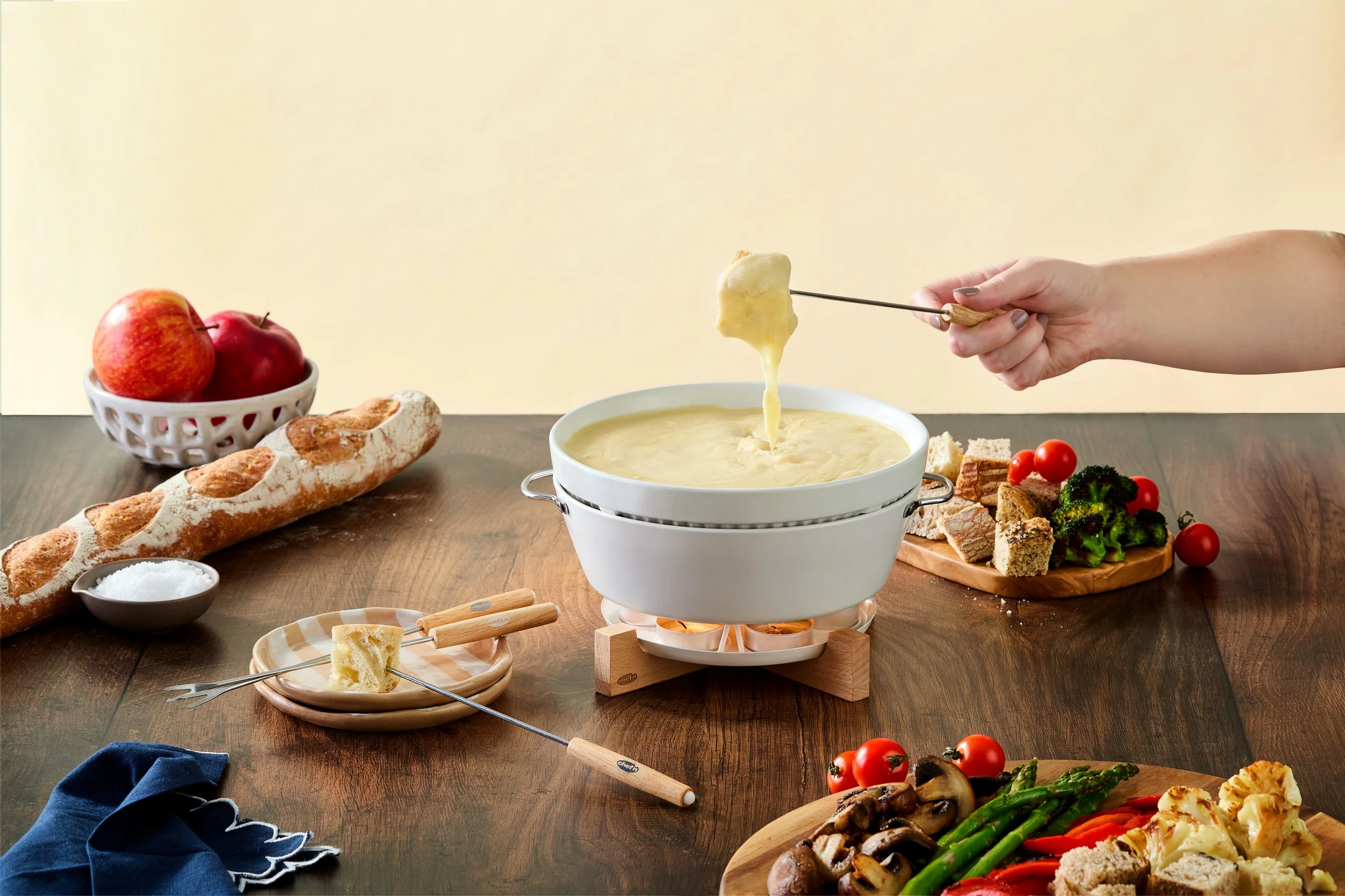
Box Front 1 - Cheese Story
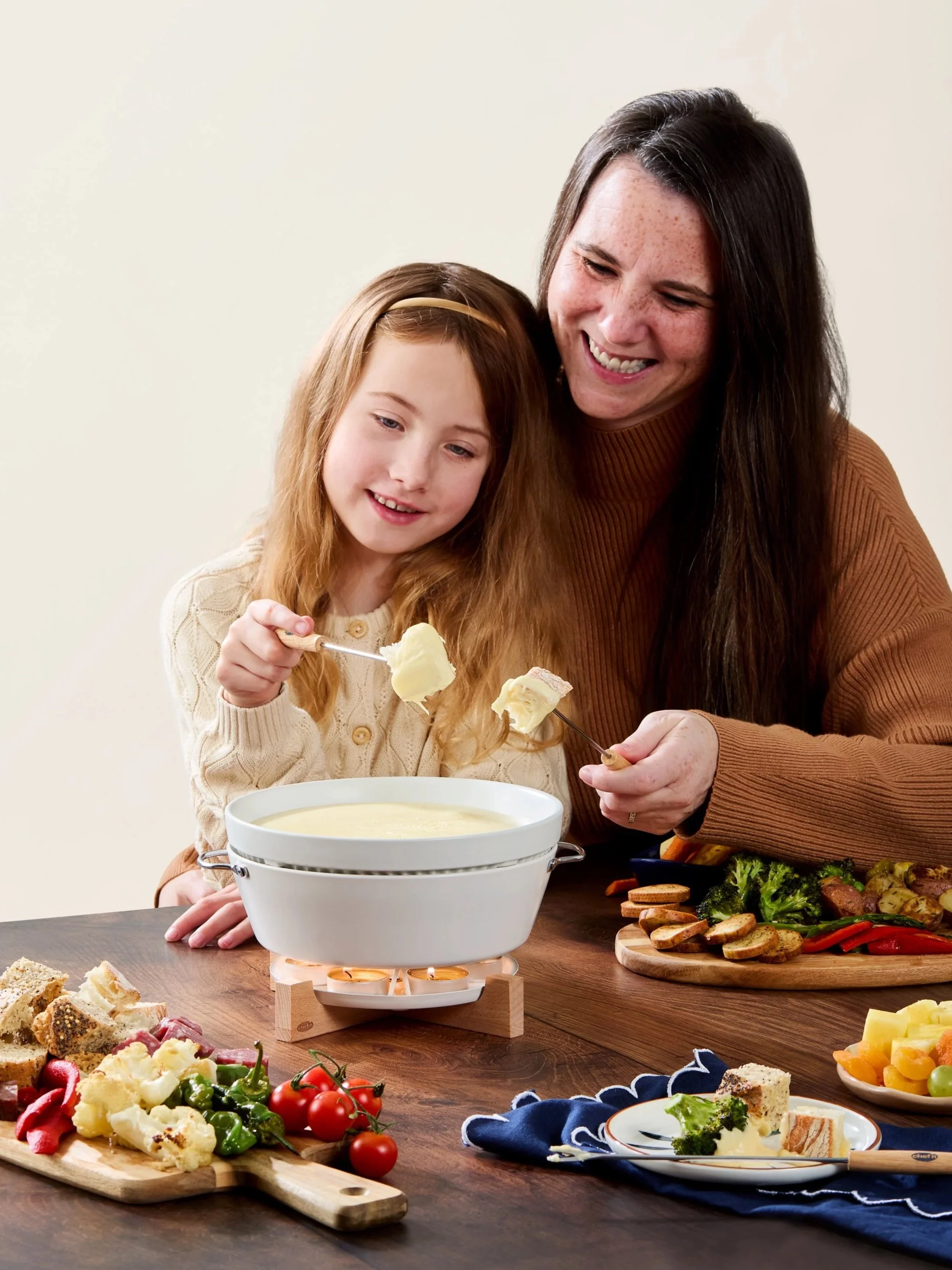
Insert and Trade Show Lifestyle - Looking for that fun and sweet moment between mother and child.
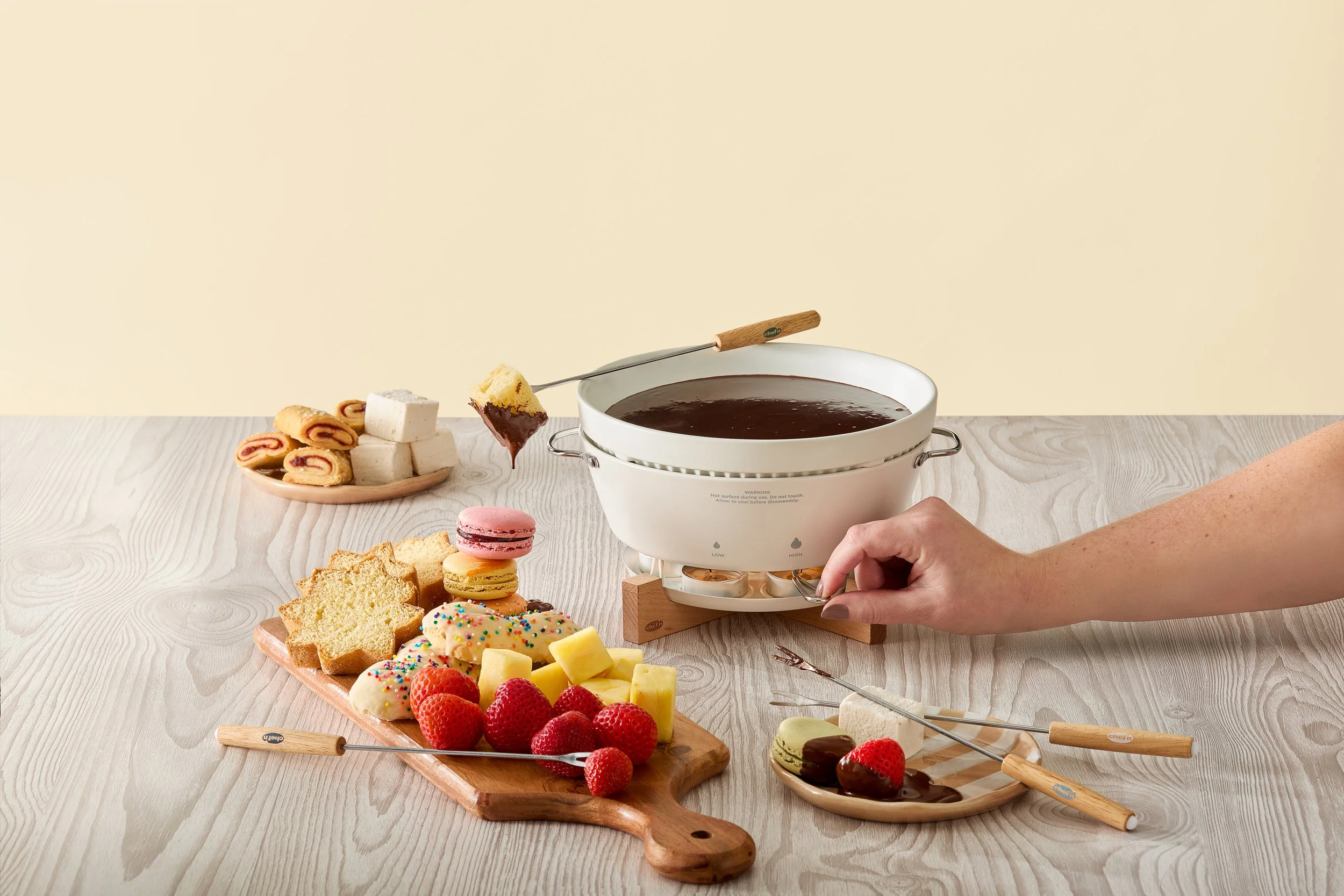
Box Front 2 - Chocolate Story, showing adjustable heat element

Insert and Trade Show Lifestyle - Had 10 extra minutes and with a bit of prompting, I was able to snag a pure-joy bonus shot from this adorable little lady!
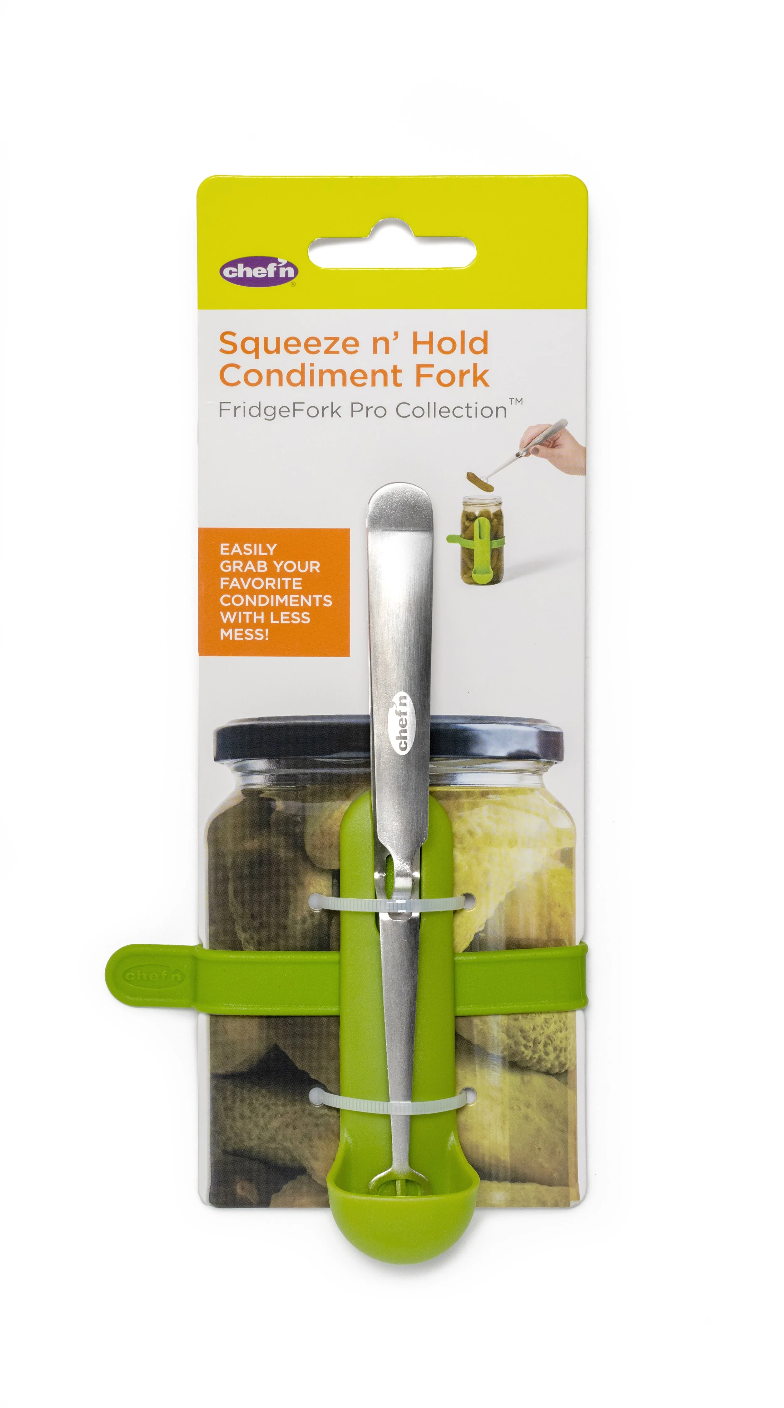
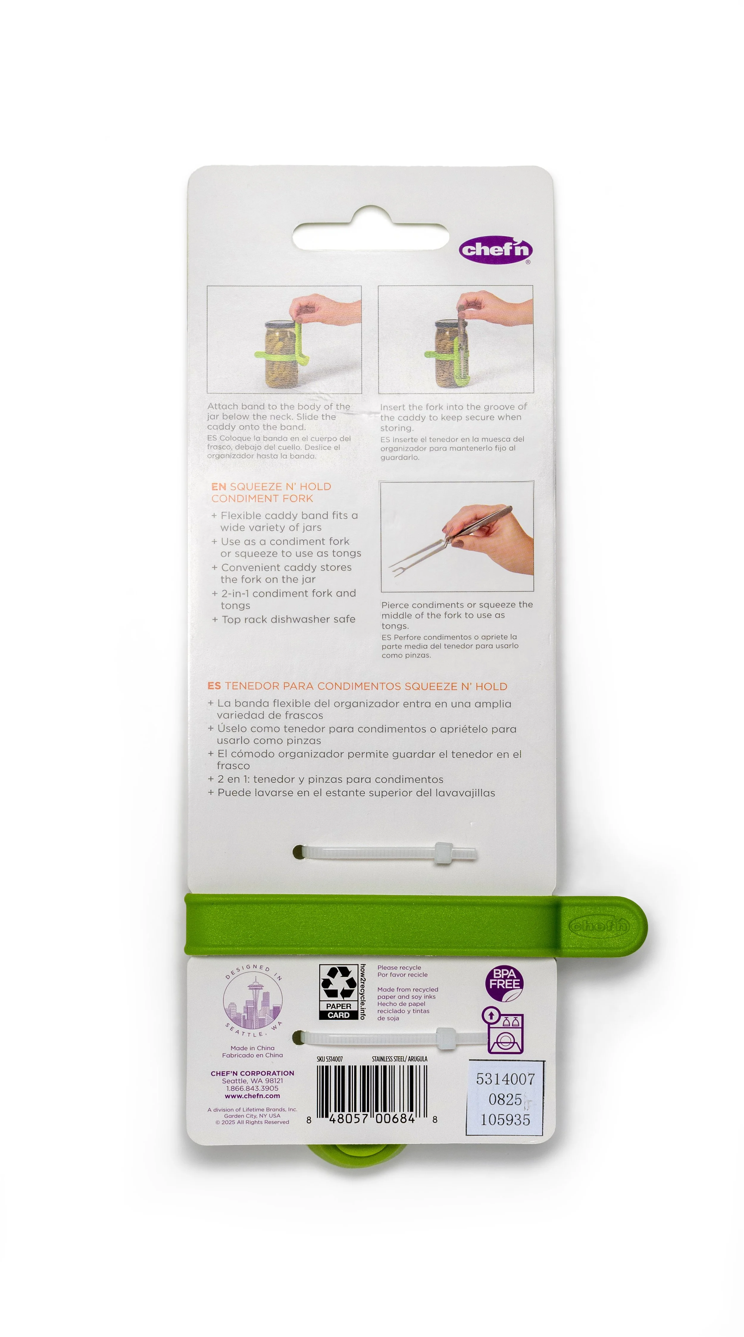
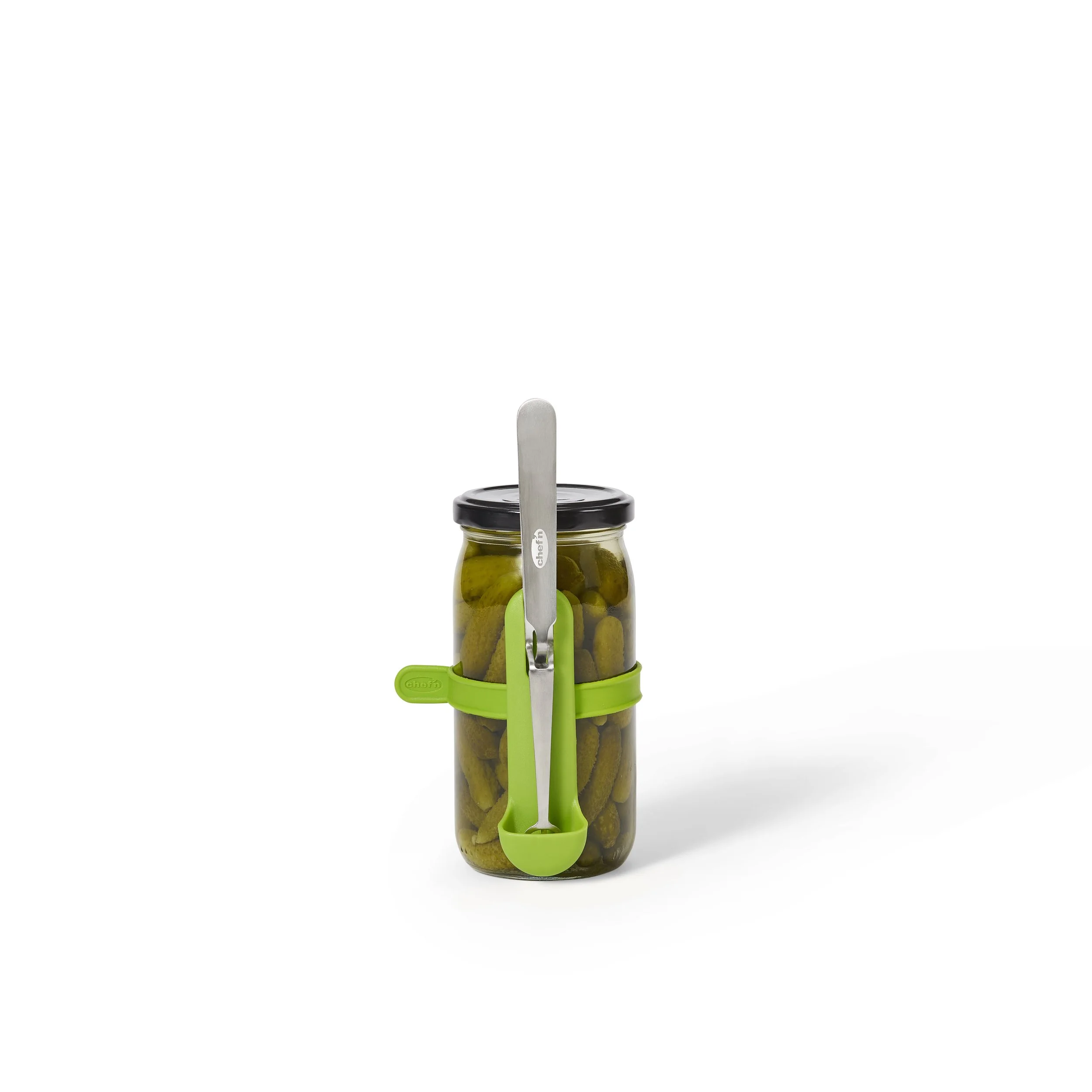
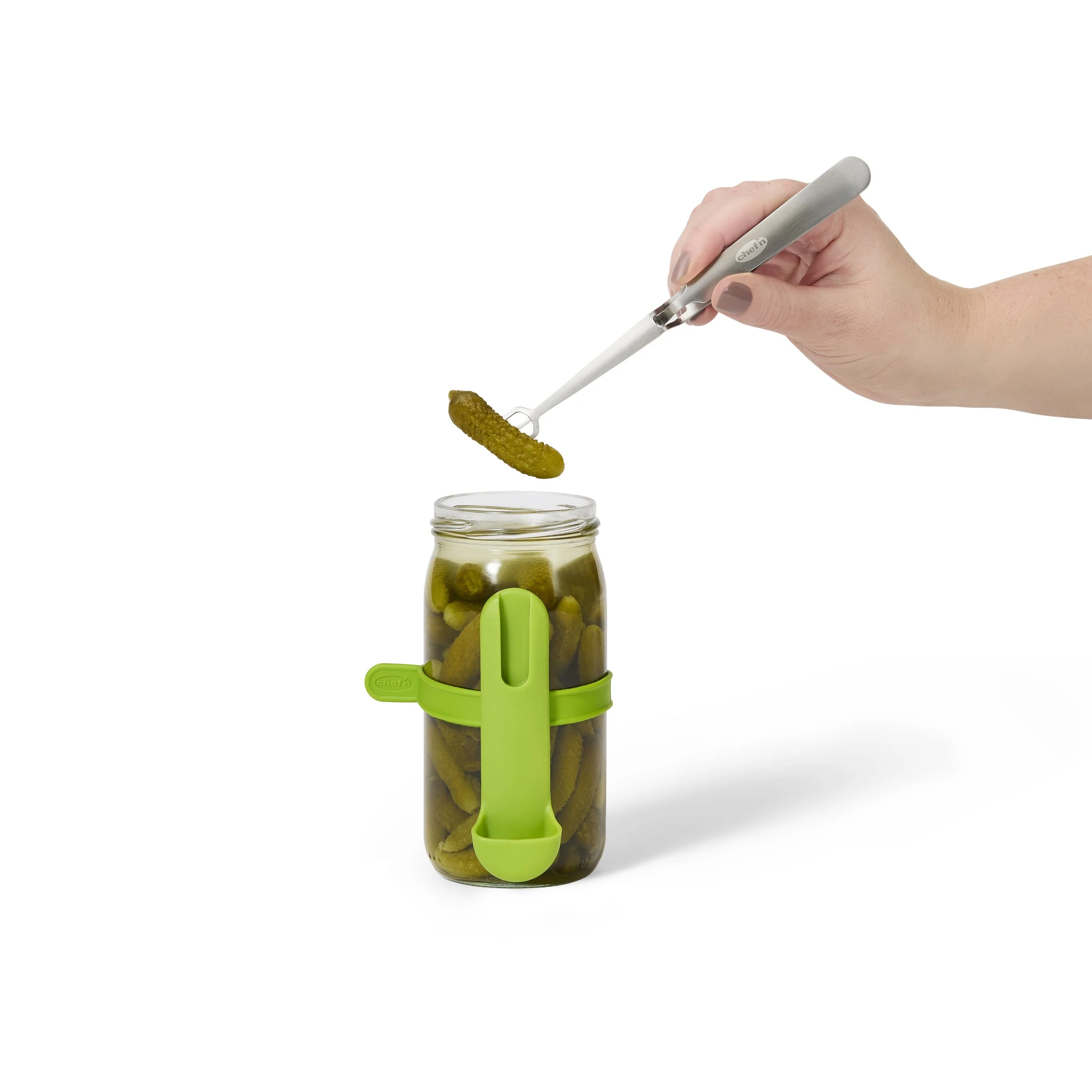
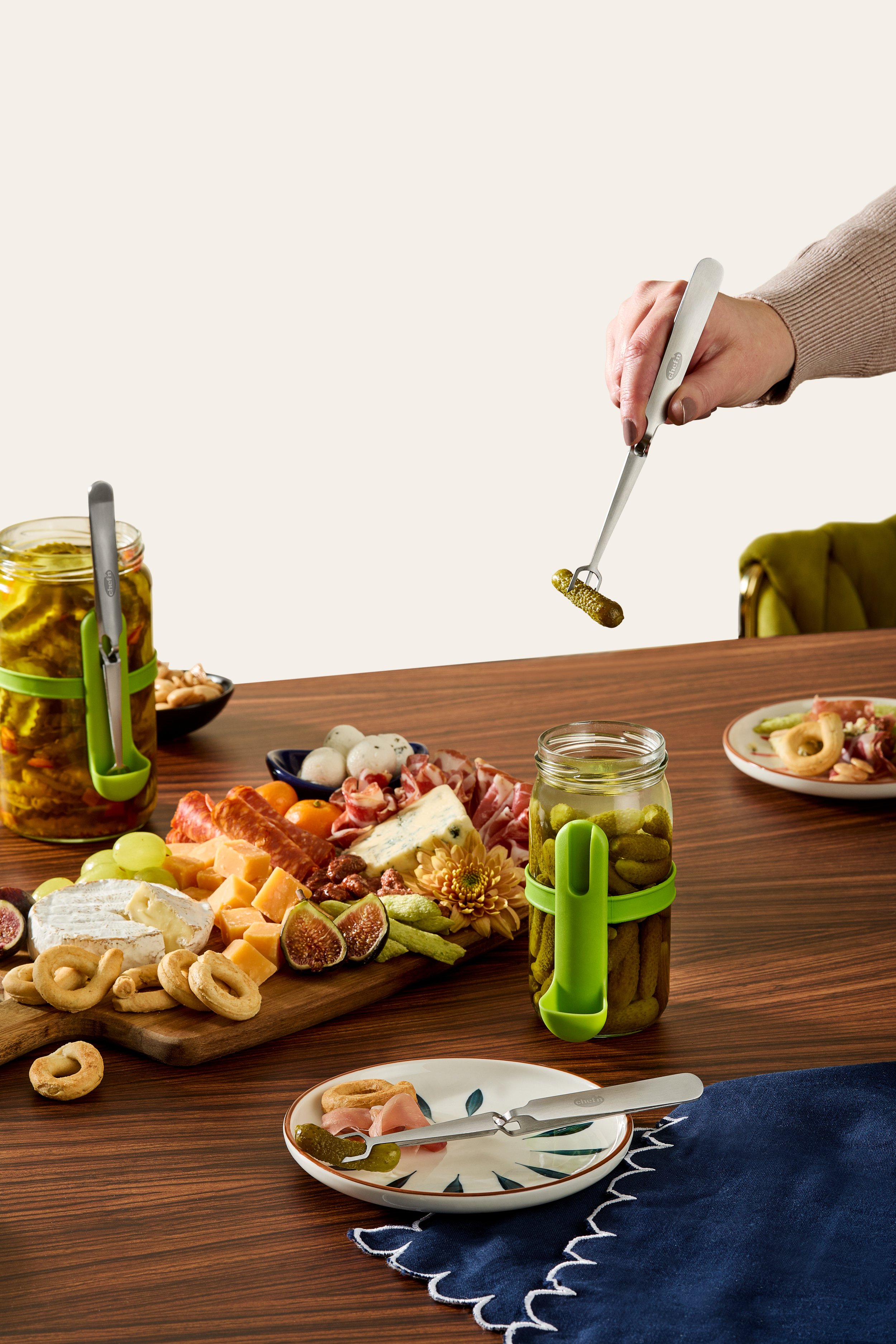
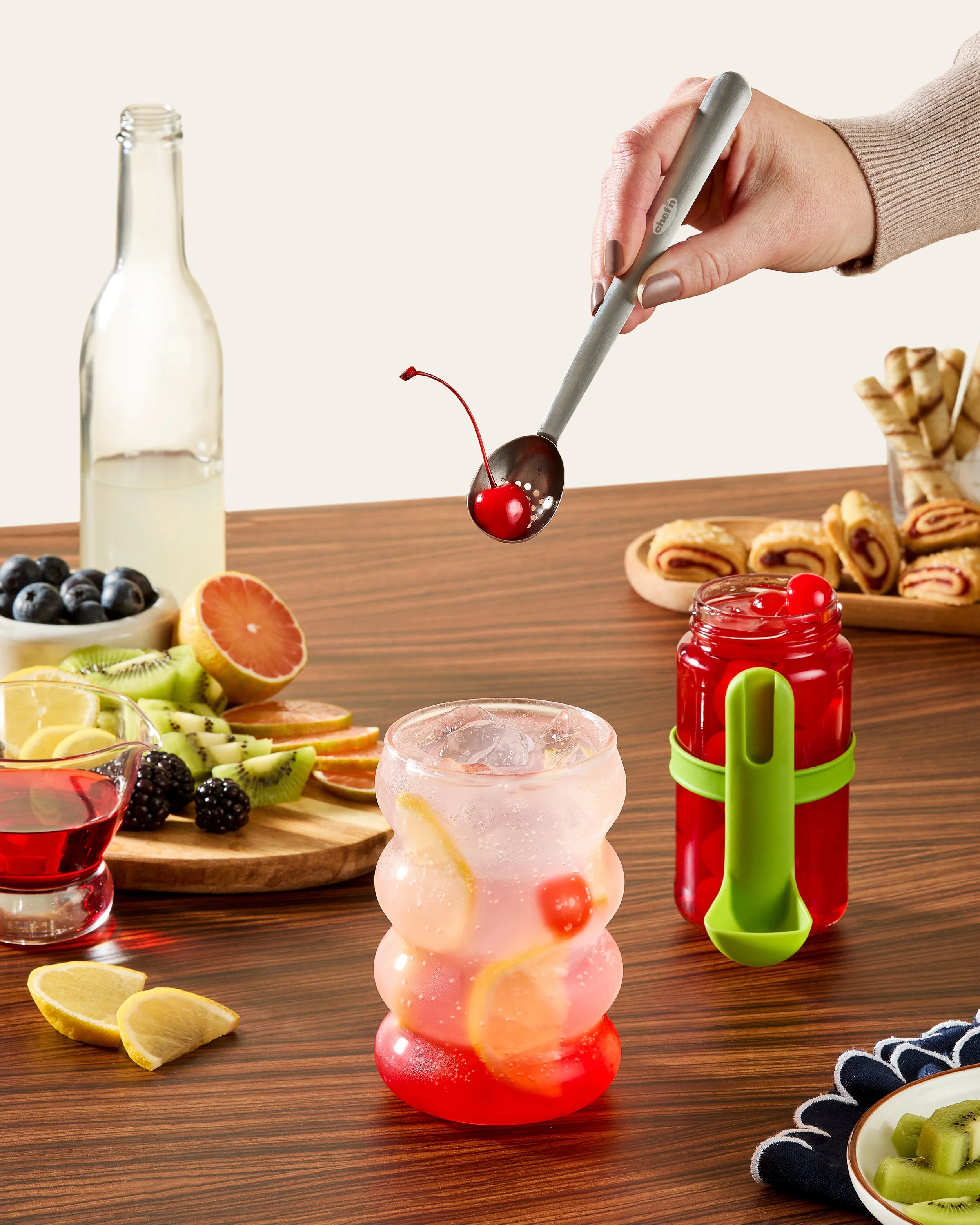
FridgeFork Pro Collection
Squeeze n’ Hold Condiment Fork in Packaging
Squeeze n’ Hold Condiment Fork Product Images


Condiment Strainer Spoon in Packaging
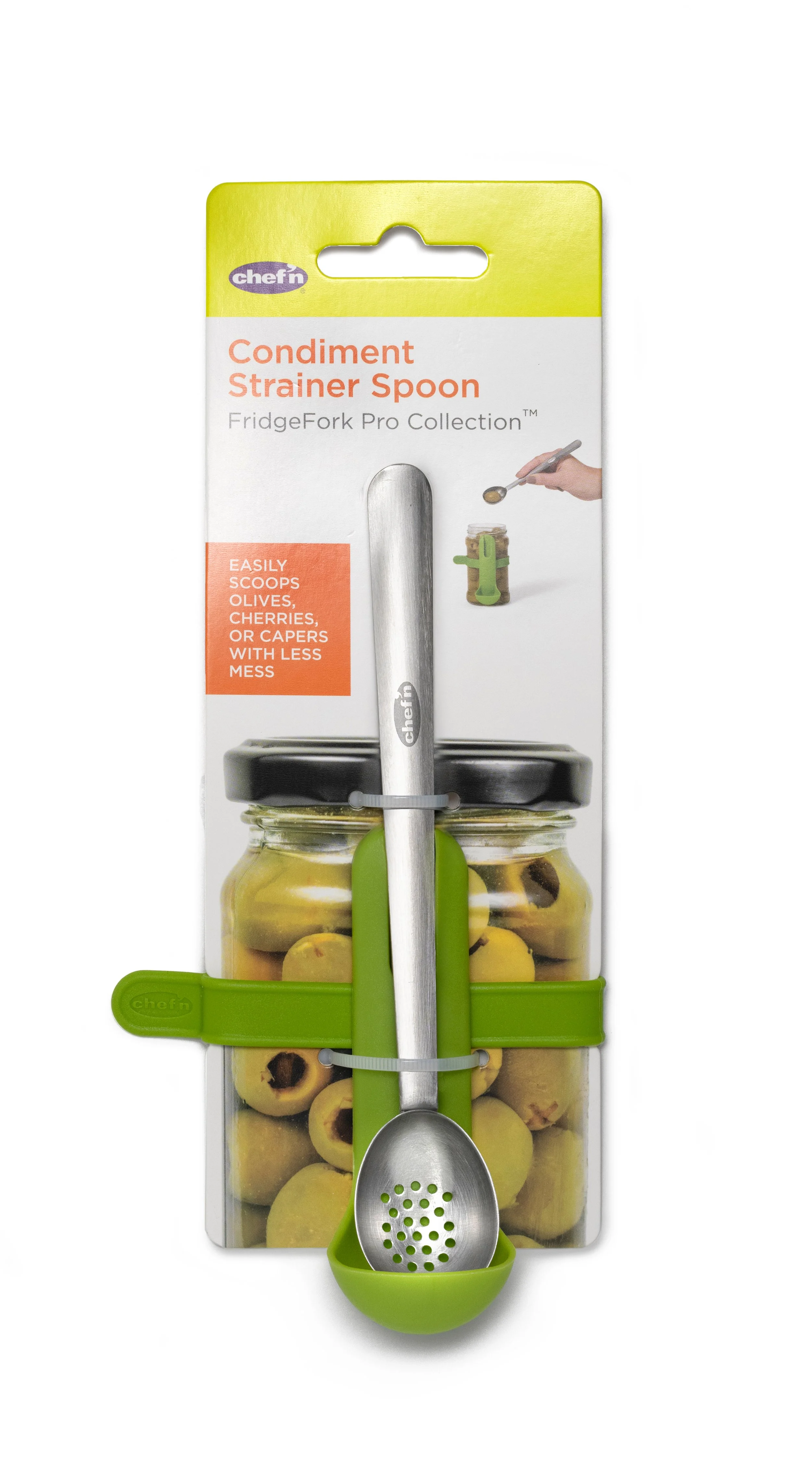

Condiment Strainer Spoon Product Photos


Corn Silkster & Peeler Nesting Corn Tool Set
Packaging
Packaging Photos


Want to see more? I have many more examples available!