
| ECOMMERCE CAMPAIGNS | Creative Direction
As the Creative Director at Jewel Box Supply I facilitated the creation of many large campaign assets that included graphic design, copy, and photography. I implemented new standards for product photography as well revamped the customer facing die cut file construction tutorials. (Jewel Box is a high production ecommerce craft company specializing in custom consumer press dies, cut files, unique prints for high quality vegan leathers/glitters, and fabrics. The majority of their clientele are small businesses who use these products to create sellable items in their own boutique shop).
Collection Campaigns
CLIENT: Jewel Box, customer facing
ROLE: Creative Director and Designer
DELIVERABLES: Utilizing illustrations from products sold in shop and product images, created cohesive collection/campaign assets for Web, Email, and Social Media. Including easy to use templates and animation on select assets for the social media team.
PROCESS: These projects have a short turn around with numerous cohesive assets that change based on the size and need of the collection, including late requests. Worked with the photography team on implementing a style guide and shot list for consistent and quality images. Due to timelines, frequently we had to make the best from what was available. To support the needs of the business, I implemented more and more template options for the social team.
Christmas Collection
This collection was all about lovely holiday colored florals with some fun prints sprinkled in. Ribbon and box lockup for that modern gift vibe.


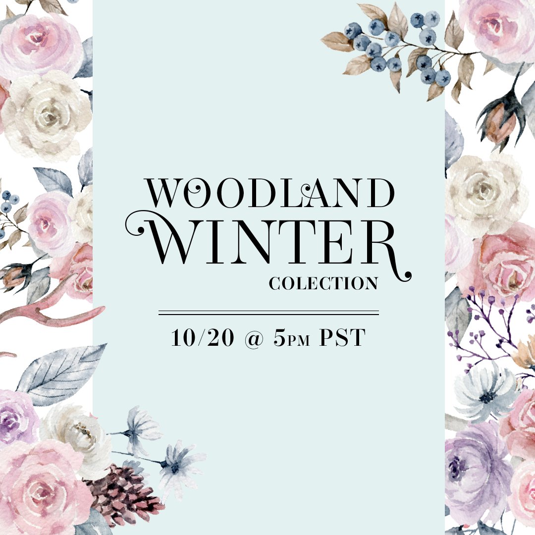
Woodland Winter Collection
Frosty florals, snow flakes, and woodsey winter white animals were center stage in this collection.


Reach for the Stars Collection
A New Years collection to spark wonder when star gazing.


Black Friday Week
Daily multiple deals makes this collection very CTA heavy. To avoid repetition, I varied the copy as much as possible.


XOXO - Love Jewel Box Collection
Bubbly, fun, pink and red Valentines Day Collection.


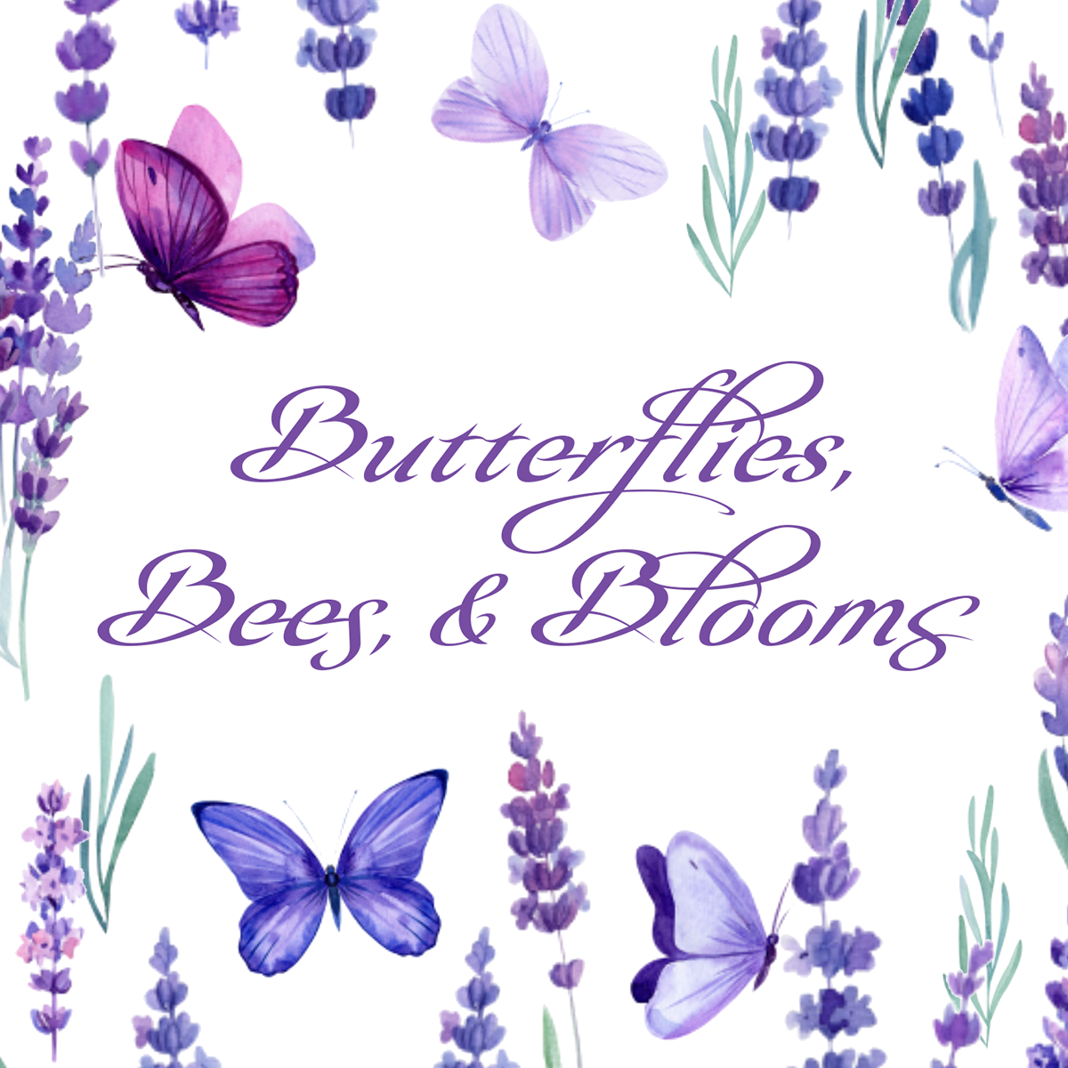
Butterflies, Bees, & Blooms Collection
What would spring be without these three things!


Going Places Collection
A Collection based on our favorite childhood books.


Feelin’ Lucky Collection
Rainbows, clovers, and pots of gold.


Seasonal & Promotions

CLIENT: Jewel Box, customer facing
ROLE: Art Director and Designer
DELIVERABLES: Short campaigns for Web, Email, and Social Media. Utilizing prints from products and the product images themselves.
PROCESS: Similar to the larger Collections, but on a much smaller scale. Due to quick turnaround needed, all of the product are composited together from multiple different photos and shadows drawn/painted in to appear like a photographed image.


Product Photography Quality & Efficiency
CLIENT: Jewel Box, internal and customer facing
ROLE: Creative Director
DELIVERABLES: Process to create a unified set of product tile images regardless of collection and the ability to execute this on a short timeline.
PROCESS: Tackling exposure and lighting first, I created a style guide with the ideal photography and lighting setup laid out. Then I went to work creating a series of templates in photoshop that would adjust any product color discrepancies and manipulate the product image into the same size and angle inside the frame. A universal shadow was also added to the template for a visually cohesive customer experience. This first template cut post production time in half. This was so successful I went on to create another set of templates to take the original product images and create working PNGs for web & social assets which eliminated a second photography shoot.
Product Images Prior Style Guide
Product tile images vary greatly from shoot to shoot. The size and angle of product in frame was not consistent, including photography lighting and post production editing creating an overall unprofessional customer experience.
Product Images After Style Guide Rollout
Consistent photography lighting setup and editing templates were created and implemented.
Product Images Prior Style Guide


Lighting varied from shoot to shoot creating inconsistent shadows. Exposure issues in general, especially with white product images being blow out/hot spots, and missing texture. Color not true to product, especially seen in reflective and glitter products (highlights are green). Original sizing method (with a quarter) was unprofessional looking.
Product Images After Style Guide Rollout


Lighting, shadows, and product color consistent. White balanced corrected (no hot spots), high level of texture/detail shown on product. Detail with sizing ruler overlay and watermark. Glitter highlights correct to actual product.