| ECOMMERCE CAMPAIGNS & CONTENT SYSTEMS | Creative Direction
As Creative Director at Jewel Box Supply, I led the development of large-scale ecommerce campaigns spanning web, email, social media, photography, and copy. Beyond campaign creation, I established new photography standards, improved production workflows, and redesigned customer-facing tutorials to create a more consistent brand experience while increasing efficiency for the internal team.
Collection Campaigns
CLIENT: Jewel Box, customer facing
ROLE: Creative Director and Designer
DELIVERABLES: Multi-channel campaign systems including website banners, email marketing assets, social media campaigns, animated content, creative templates, photography direction, and scalable design frameworks that supported both marketing and social media teams.
CHALLENGE & APPROACH: Develop cohesive multi-channel campaigns that could be executed quickly while maintaining a consistent visual identity across web, email, and social media. Working within aggressive timelines and frequently evolving product assortments, I established photography standards, scalable design templates, and creative frameworks that allowed the team to produce high volumes of campaign assets without sacrificing quality or brand consistency.
Christmas Collection
This collection was all about lovely holiday colored florals with some fun prints sprinkled in. Ribbon and box lockup for that modern gift vibe.


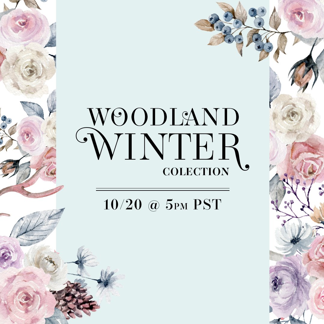
Woodland Winter Collection
Frosty florals, snowflakes, and woodland animals took center stage in this cozy winter collection.




Reach for the Stars Collection
A New Year's collection inspired by stargazing, wonder, and a little bit of magic.


Black Friday Week
Daily multiple deals makes this collection very CTA heavy. To avoid repetition, I varied the copy as much as possible.


XOXO - Love Jewel Box Collection
Bubbly, playful, and unapologetically pink—everything a Valentine's collection should be.


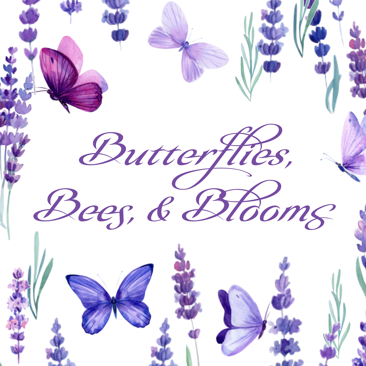
Butterflies, Bees, & Blooms Collection
What would spring be without these three things!




Going Places Collection
A Collection based on our favorite childhood books.


Feelin’ Lucky Collection
Rainbows, clovers, and pots of gold.


Seasonal & Promotions
CLIENT: Jewel Box, customer facing
ROLE: Art Director and Designer
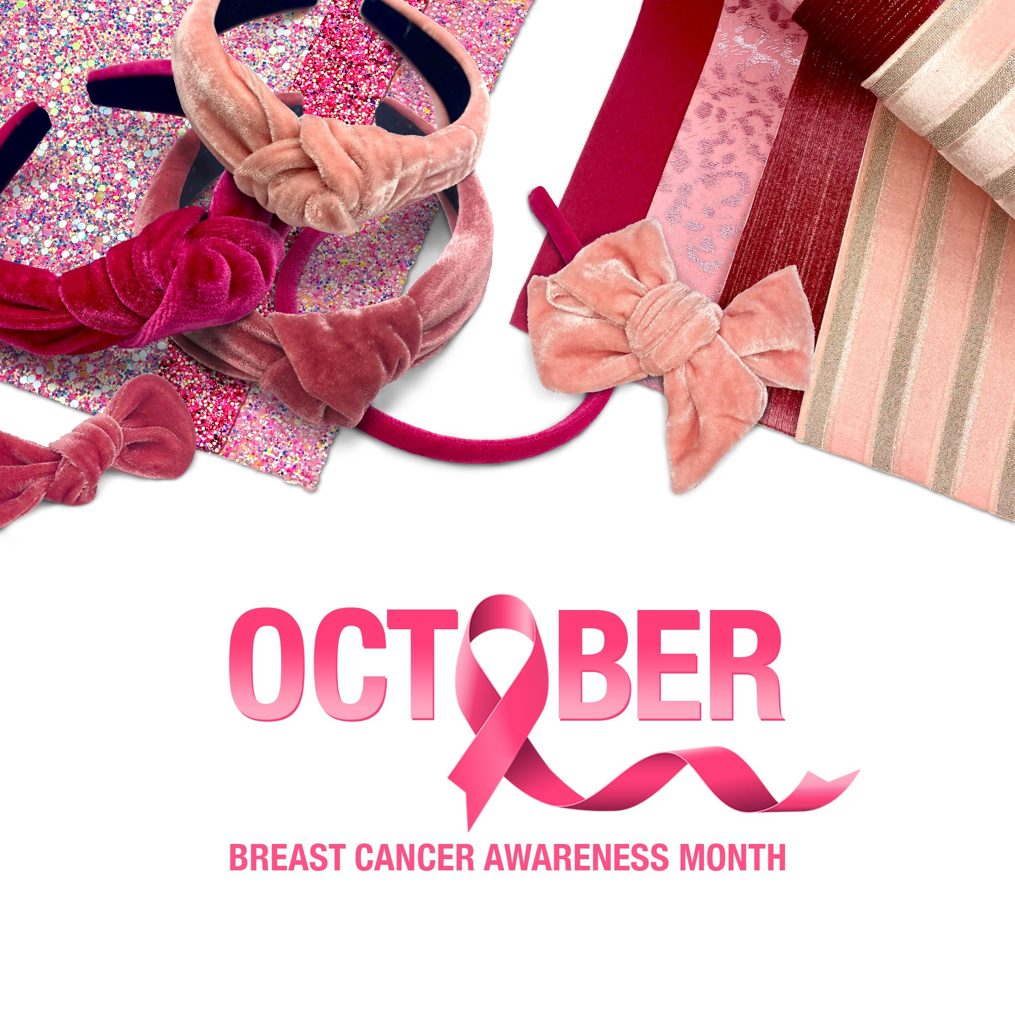
DELIVERABLES: Short campaigns for Web, Email, and Social Media. Utilizing prints from products and the product images themselves.
CHALLENGE & APPROACH: Create high-impact promotional campaigns on extremely short timelines without the benefit of dedicated photography shoots. To meet the needs of the business, I developed composite imagery using existing product photography, digitally recreating lighting, shadows, and product arrangements to create cohesive campaign assets for web, email, and social media.


Product Photography Quality & Efficiency
CLIENT: Jewel Box, internal and customer facing
ROLE: Creative Director
CHALLENGE & APPROACH: Create a more consistent and professional product photography experience while reducing production and post-processing time. I began by developing photography standards that defined lighting, exposure, composition, and product positioning. From there, I created a series of Photoshop templates that standardized product sizing, color correction, shadow creation, and image placement. The system was later expanded to generate production-ready PNG assets for web and social media, eliminating the need for additional photography and significantly improving workflow efficiency.
DELIVERABLES: Process to create a unified set of product tile images regardless of collection and the ability to execute this on a short timeline.
OUTCOME: Established photography and post-production standards that improved image consistency across the website, reduced post-production time by more than 50%, and eliminated the need for secondary photography shoots when creating marketing assets.
Product Images Prior Style Guide
Product tile images vary greatly from shoot to shoot. The size and angle of product in frame was not consistent, including photography lighting and post production editing creating an overall unprofessional customer experience.
Product Images After Style Guide Rollout
Consistent photography lighting setup and editing templates were created and implemented.
Product Images Prior Style Guide


Lighting varied from shoot to shoot creating inconsistent shadows. Exposure issues in general, especially with white product images being blow out/hot spots, and missing texture. Color not true to product, especially seen in reflective and glitter products (highlights are green). Original sizing method (with a quarter) was unprofessional looking.
Product Images After Style Guide Rollout


Lighting, shadows, and product color consistent. White balanced corrected (no hot spots), high level of texture/detail shown on product. Detail with sizing ruler overlay and watermark. Glitter highlights correct to actual product.