| CHEF’N PRODUCT PHOTOGRAPHY FOR PACKAGING | Art Direction & Graphic Design
CLIENT: Chef’n DTC customers, Retailers, Wholesalers, and Amazon
ROLE: Art Director & Graphic Design
DELIVERABLES: Packaging artwork ready for print, compliance-approved photography, and asset families that scaled across SKUs. This ensures consistency from studio to shelf and across online and offline environments
TEAM: Producer: Shelley McCracken, Photographer: Ryan Castoldi, Model: Carly Hood
CHALLENGE & APPROACH: Create packaging photography that clearly communicates product functionality, supports compliance requirements, and strengthens the retail shelf presence of the Chef'n brand. As Art Director, I developed shot lists, directed photography, collaborated with copy and compliance teams, and ensured each image could support packaging, instructions, displays, and marketing materials while maintaining a consistent visual experience across the product line.
OUTCOME: Developed photography assets that were successfully leveraged across packaging, product instructions, ecommerce, web, advertising, retail displays, and trade show materials, creating a consistent visual experience across every customer touchpoint.
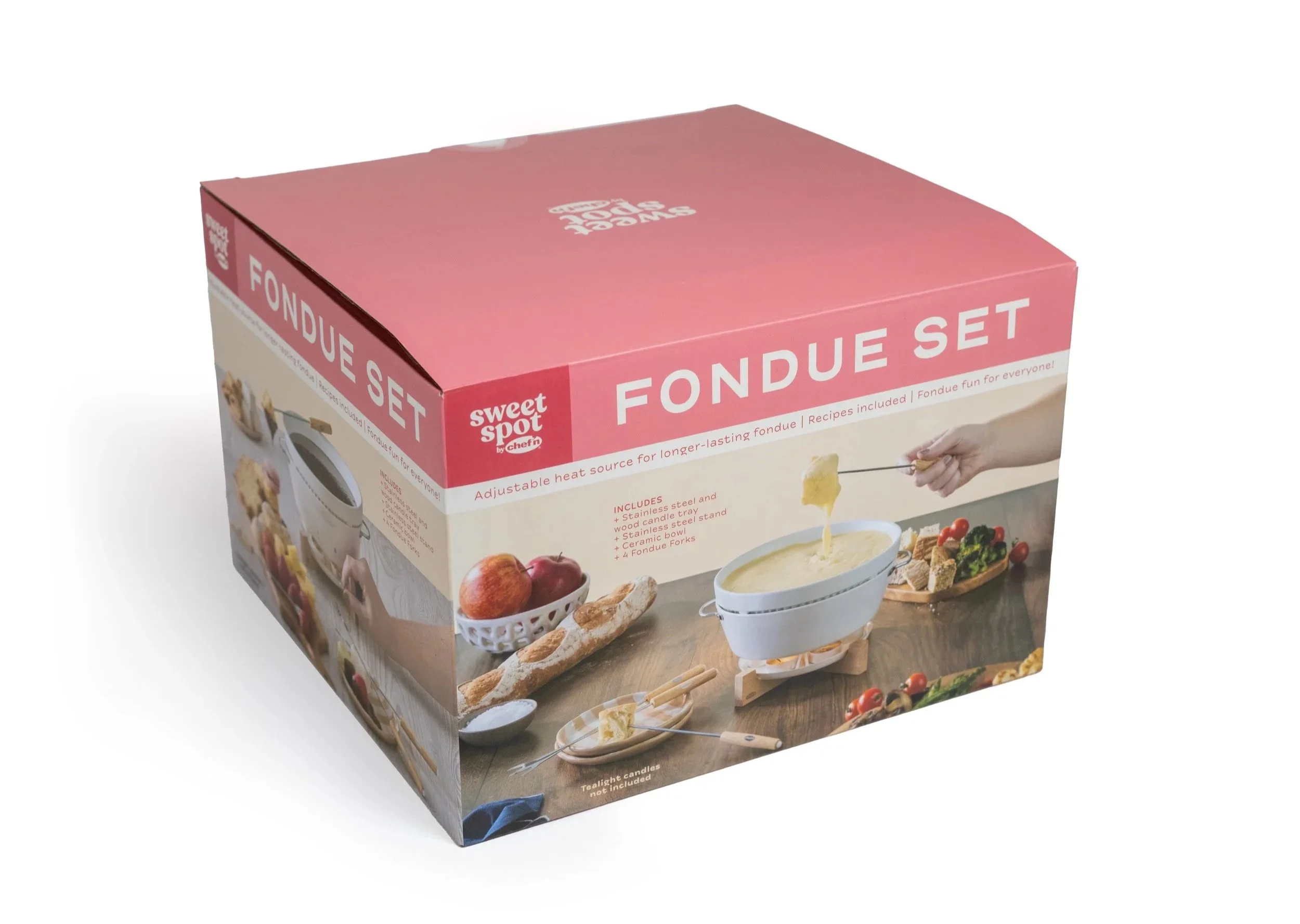
Sweet Spot Fondue Set


Working closely with the copy and compliance teams, I developed detailed shot lists that outlined image requirements, product interactions, props, and usage scenarios. Beyond the standard information, I also included in-use references showing hands interacting with the product, helping photographers and talent quickly understand what each image needed to communicate. This approach kept the shoot efficient while ensuring every asset supported both packaging objectives and customer understanding.
One of my key visual priorities was hierarchy—making sure the product identity, use case, and packaging cues were clear at first glance. That meant thoughtful decisions around lighting, composition, and framing to highlight product features while avoiding unnecessary visual clutter. These details help improve scanability, which is critical in both retail and ecommerce environments.
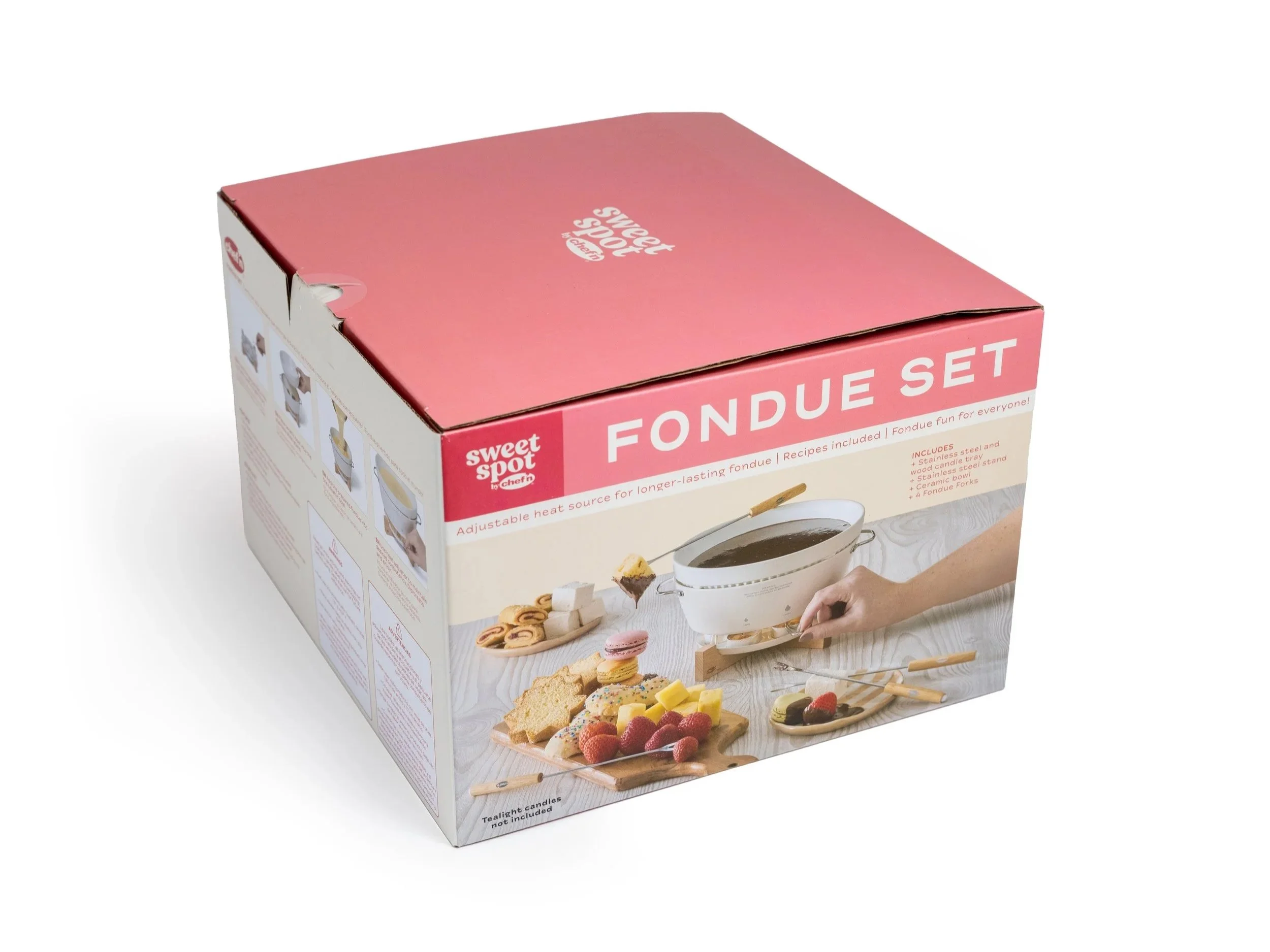
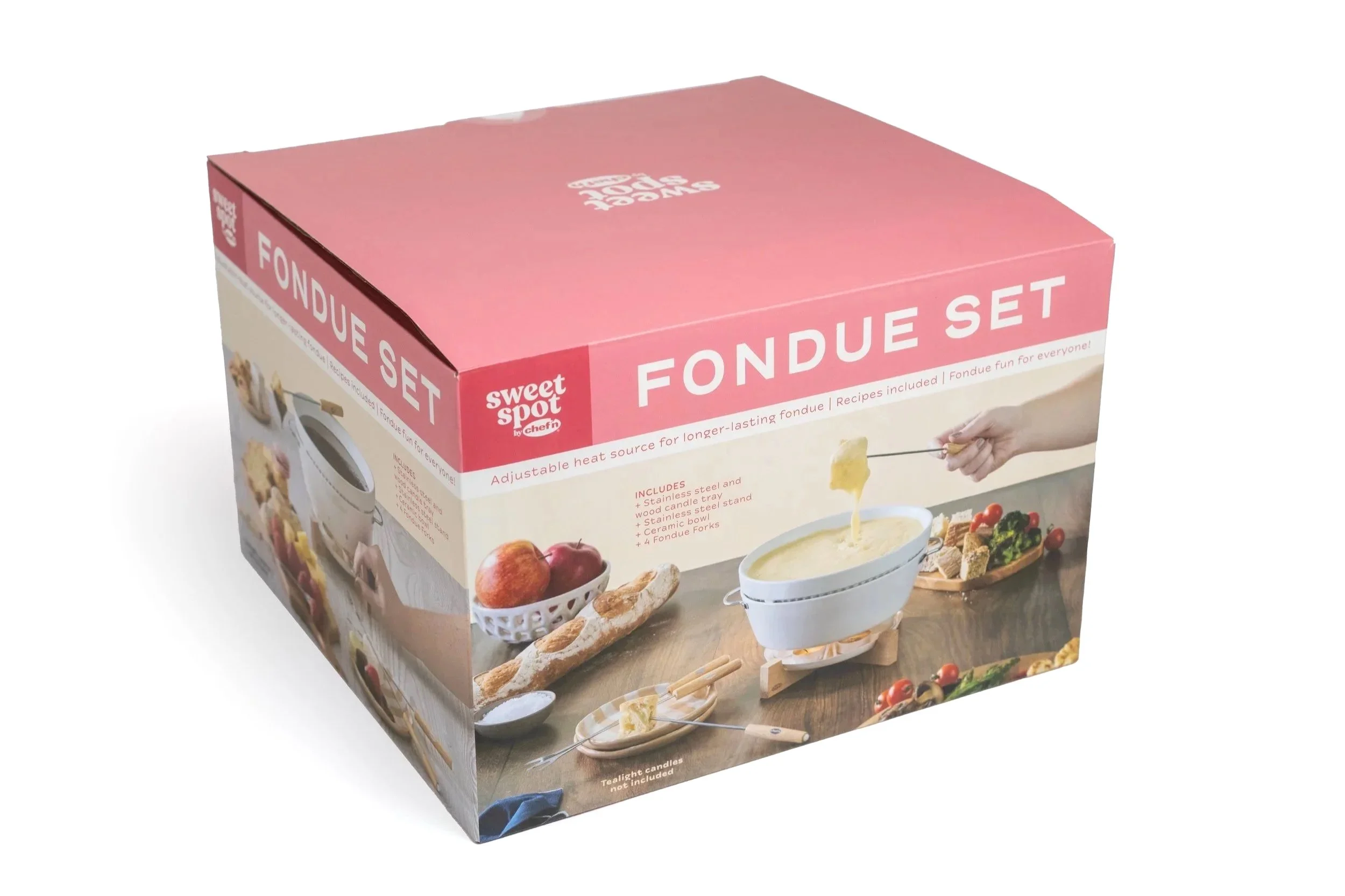
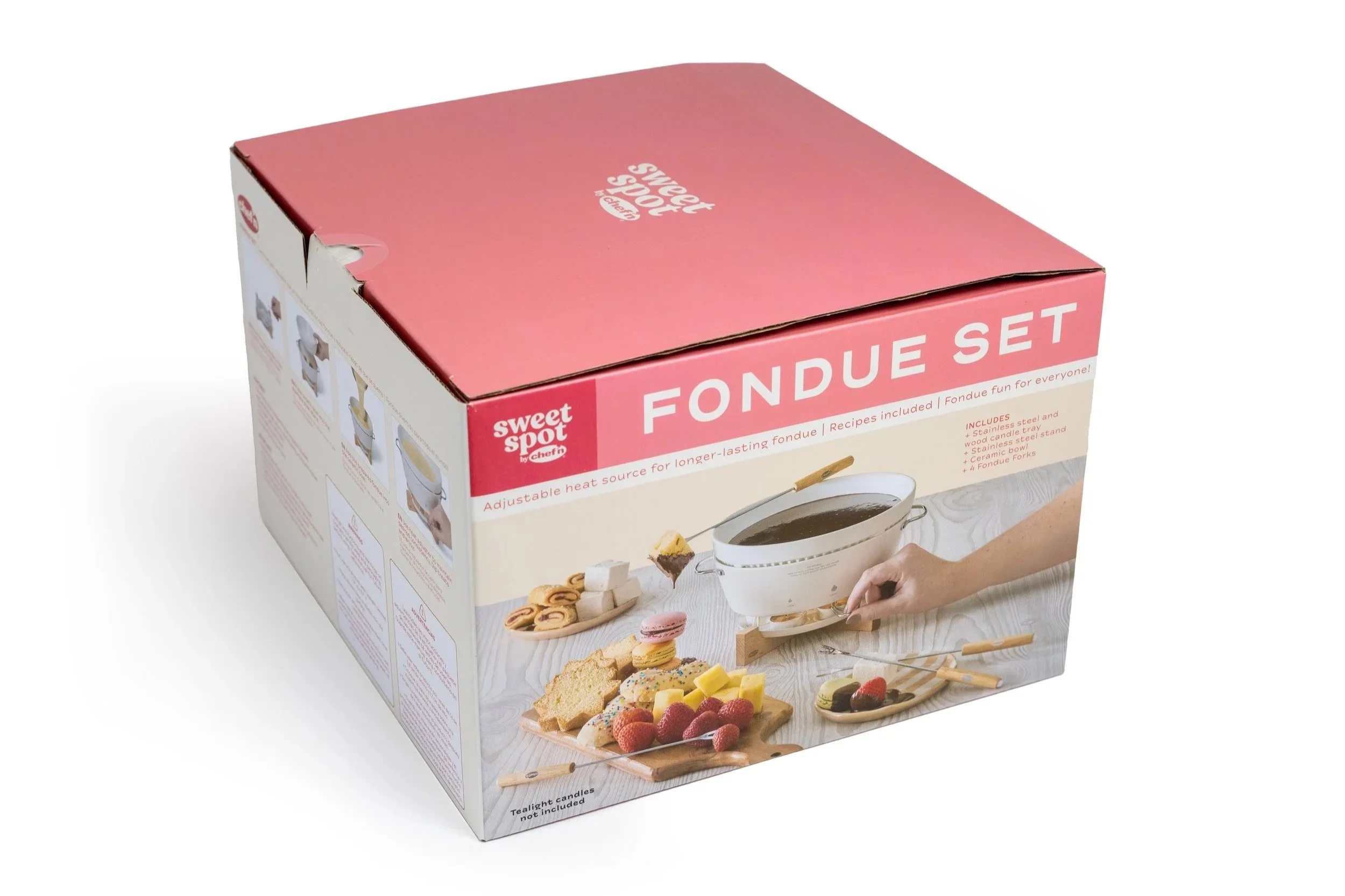
For the Sweet Spot product line, I also considered how the packaging would function on shelf. Because the line was positioned as a more premium and giftable offering, I designed the photography to support two primary front-facing presentations, allowing either the cheese or chocolate experience to take center stage depending on the season or merchandising strategy.
Packaging Images and Dielines
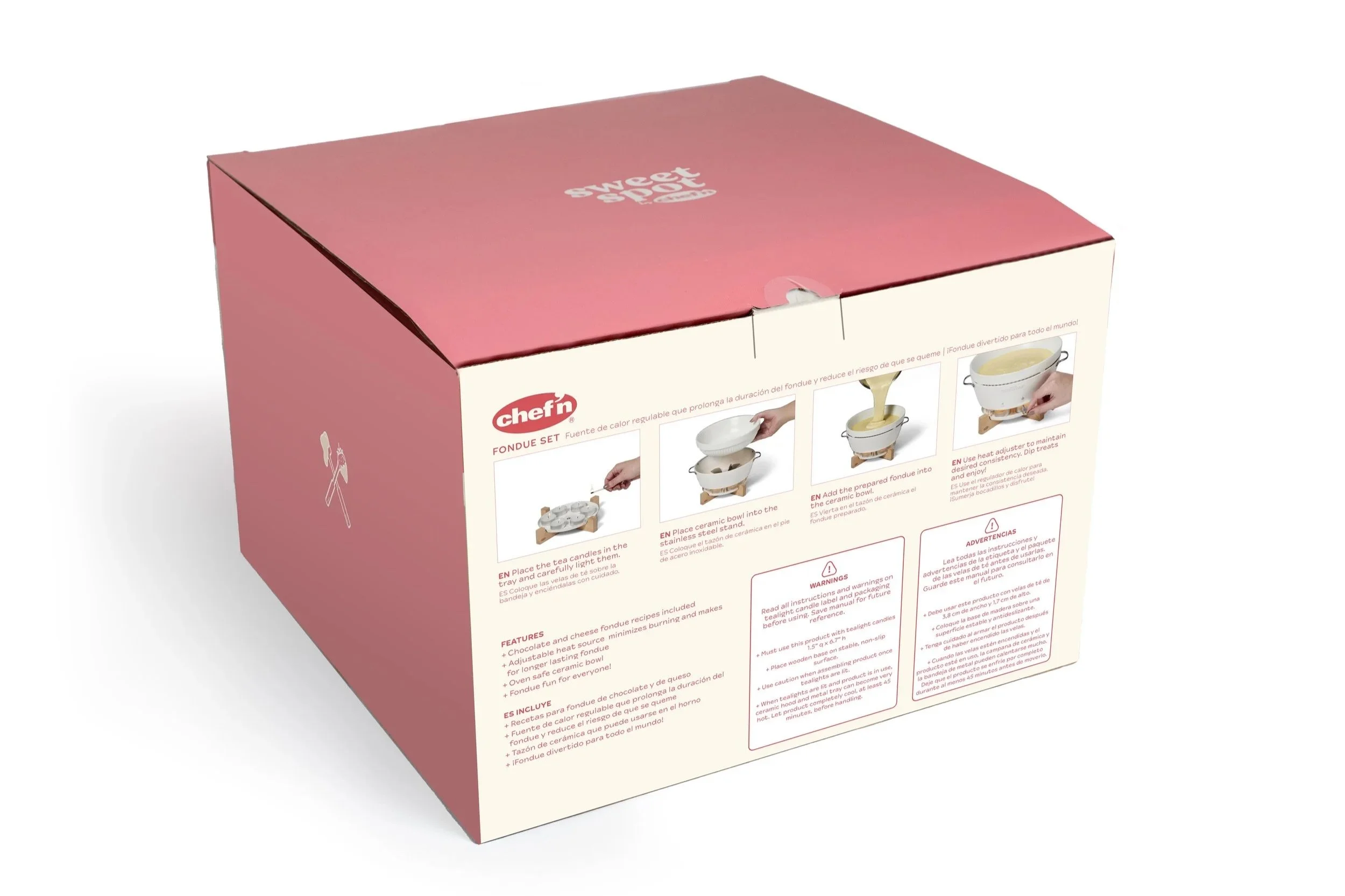


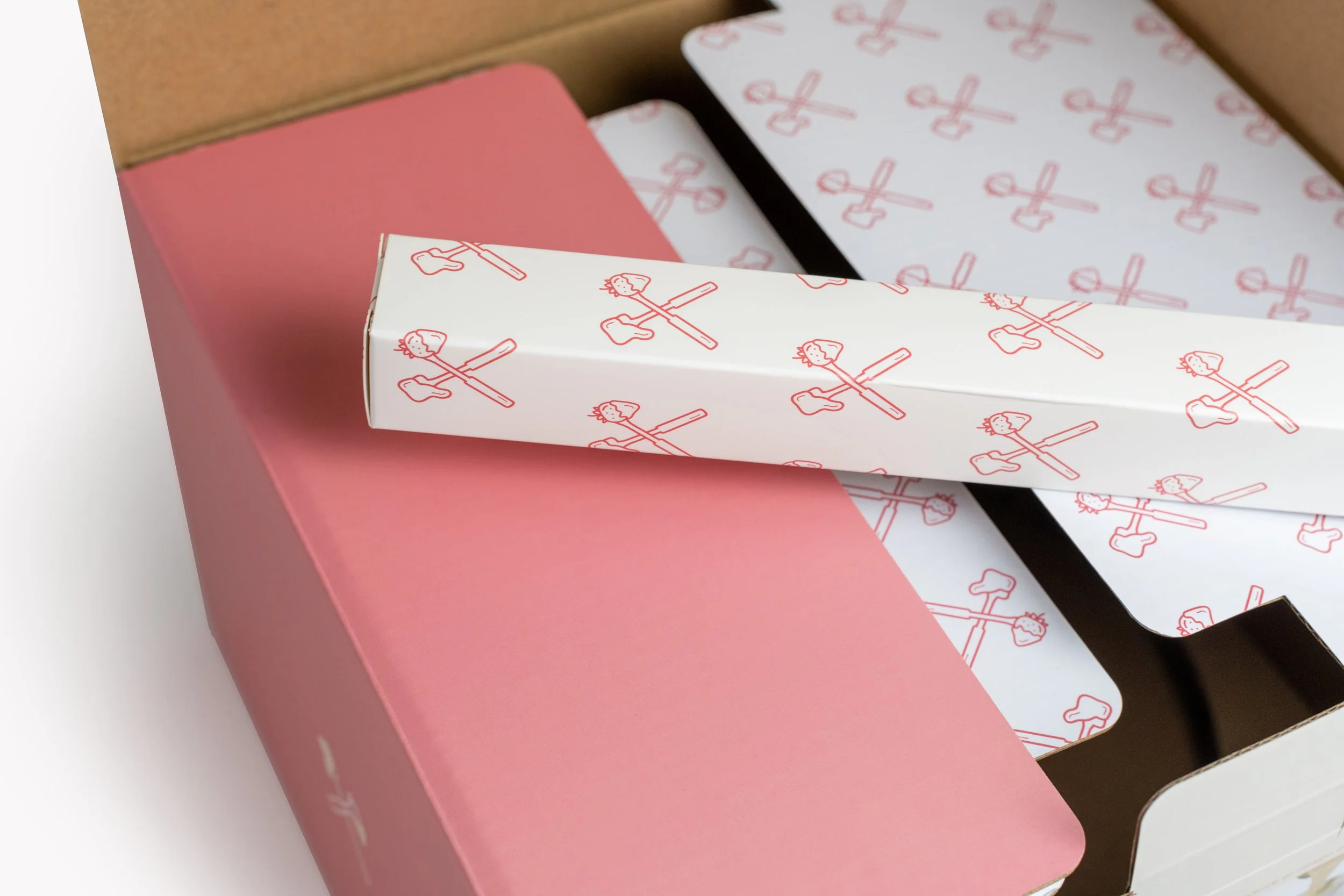
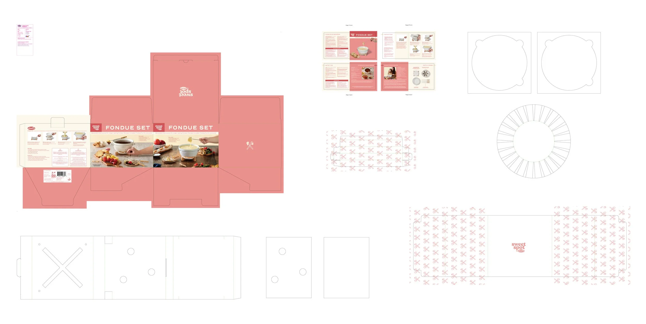
Balancing Cost & Elevating the Unboxing Experience - One design element I championed was a repeating pattern on the interior packaging flaps. While not everyone initially saw the value, I tied the concept back to the overall brand experience and the opportunity to elevate the unboxing moment without adding costly print treatments. Ultimately, we implemented the pattern as a single-color graphic, balancing cost efficiency with visual impact.
Packaging Photography & Product Instructions
Images for packaging directions and insert


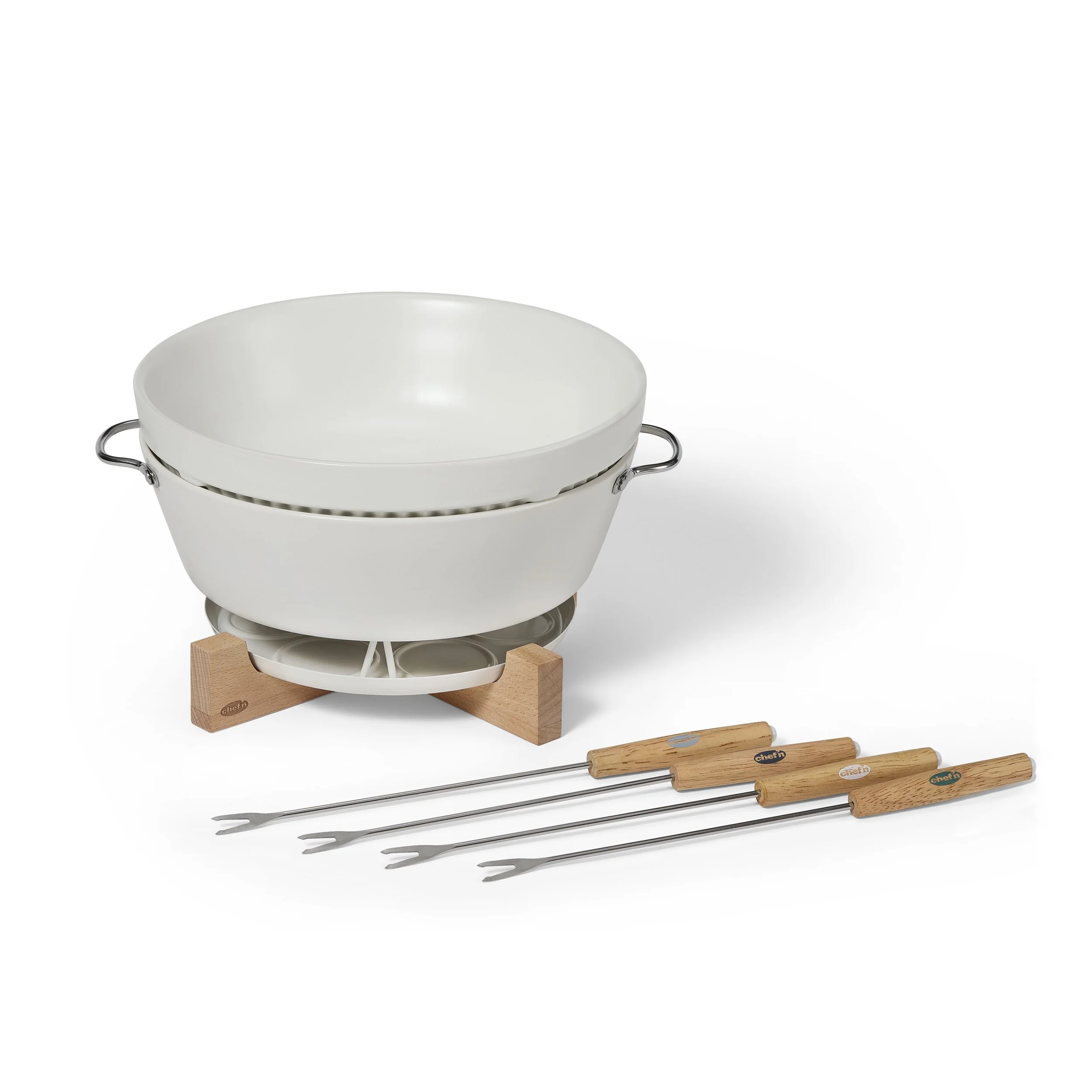
Lifestyle images for packaging box and insert
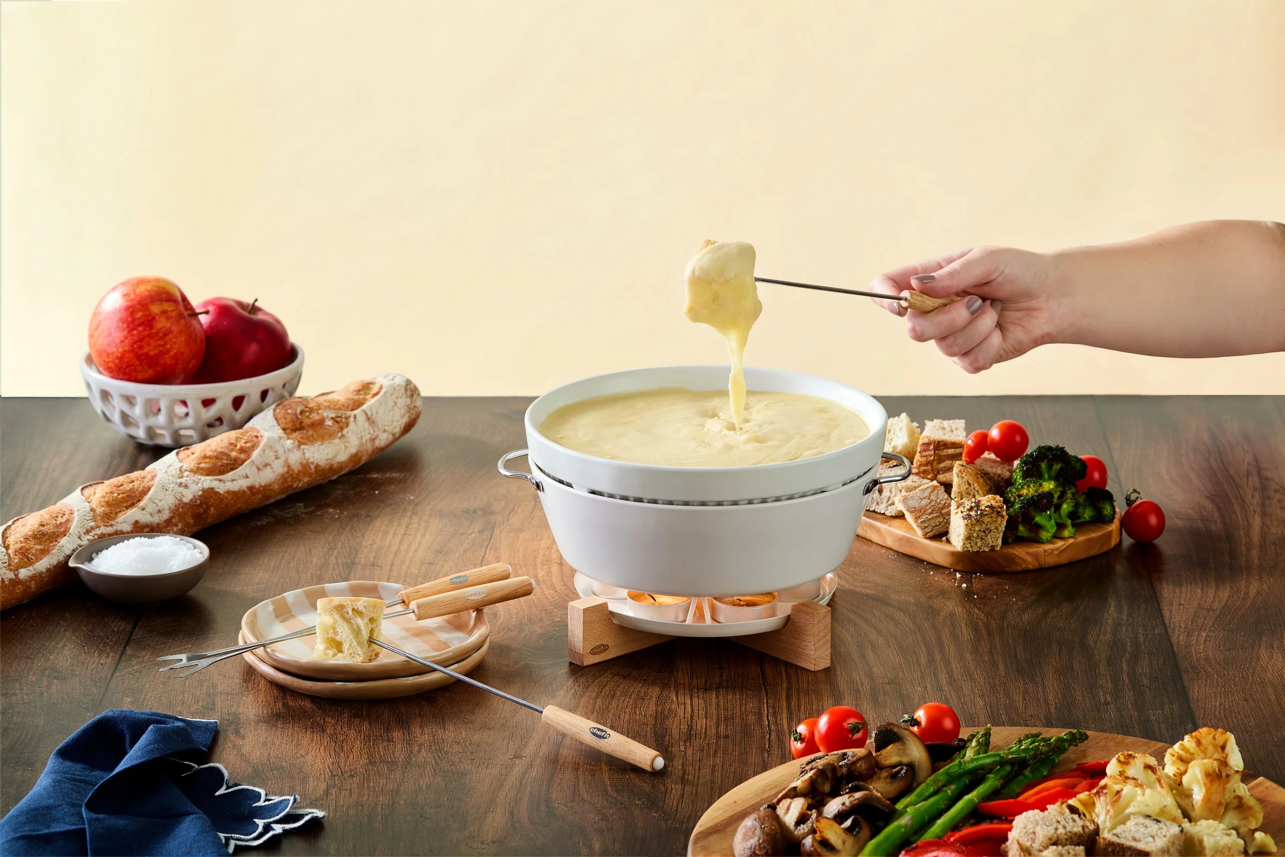
Box Front 1 - Cheese Story
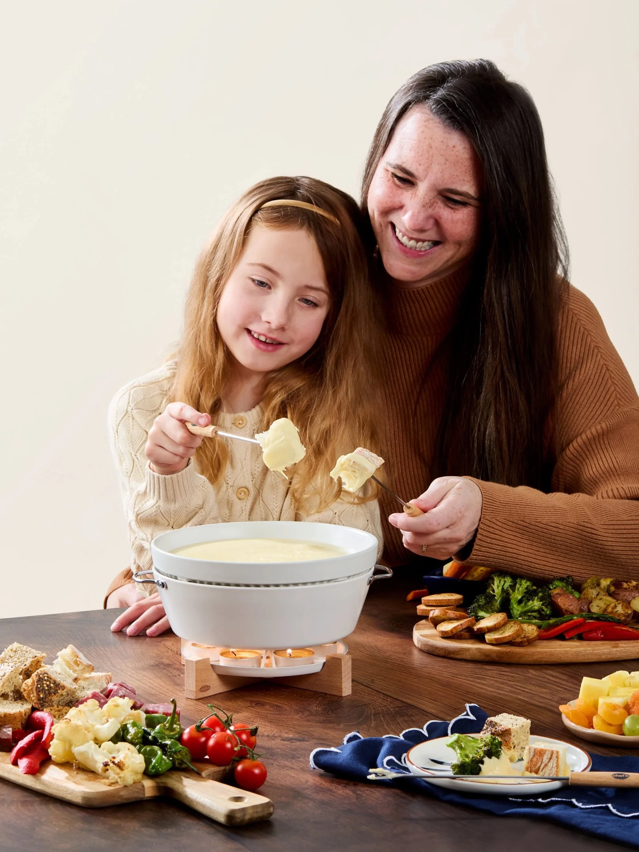
Insert and Trade Show Lifestyle - I wanted these images to feel genuine rather than overly staged, capturing a simple moment between mother and child that supported the brand's warm, giftable personality.
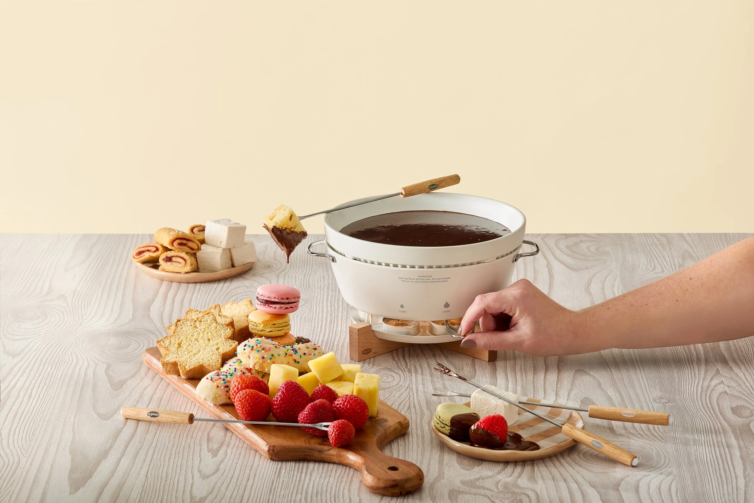
Box Front 2 - Chocolate Story, showing adjustable heat element
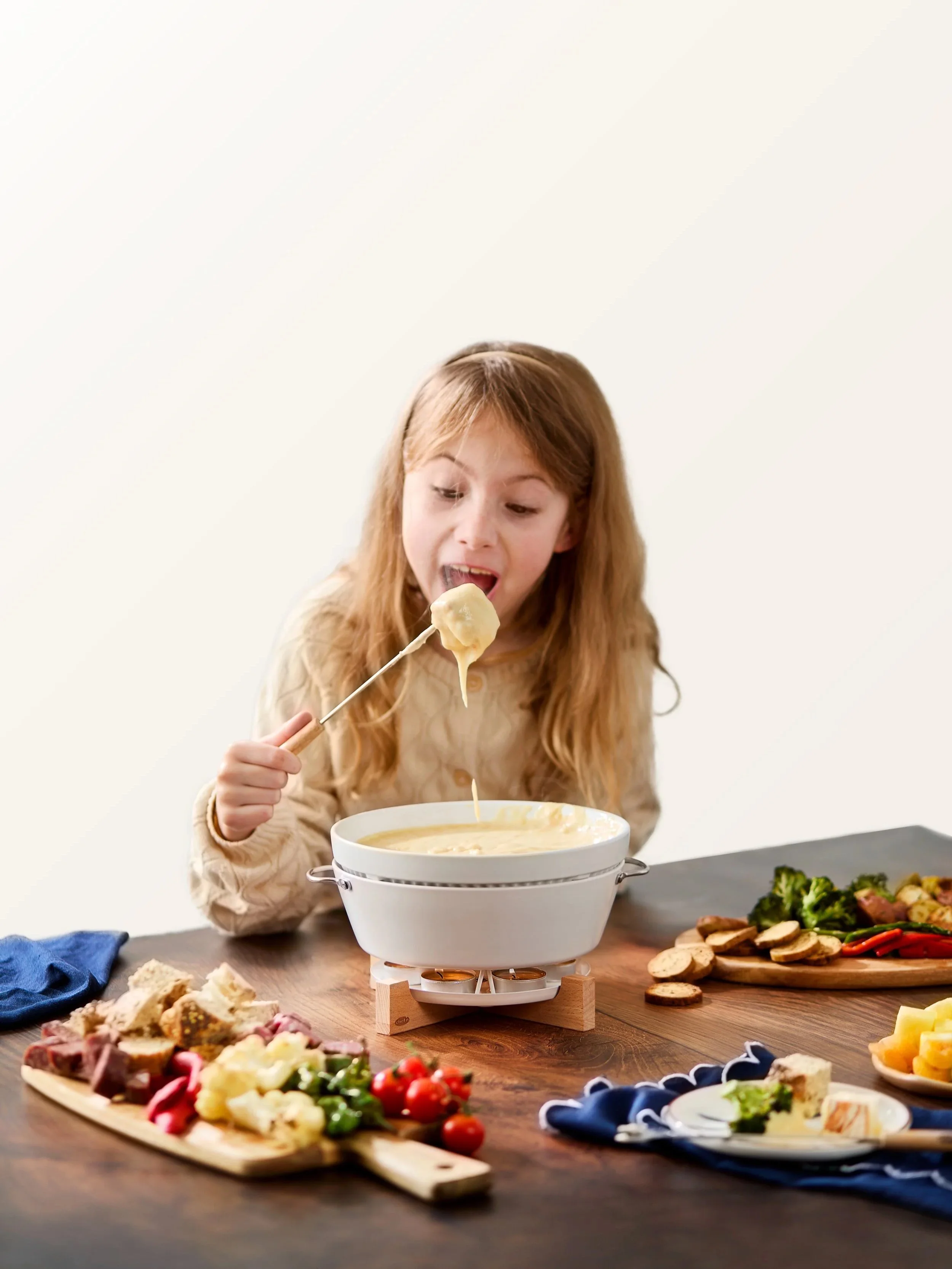
Insert and Trade Show Lifestyle - Sometimes the best images aren't on the shot list. With a few extra minutes and a little encouragement, we captured a bonus moment that ended up becoming one of my favorite images from the shoot.
FridgeFork Pro Collection
Squeeze n’ Hold Condiment Fork in Packaging
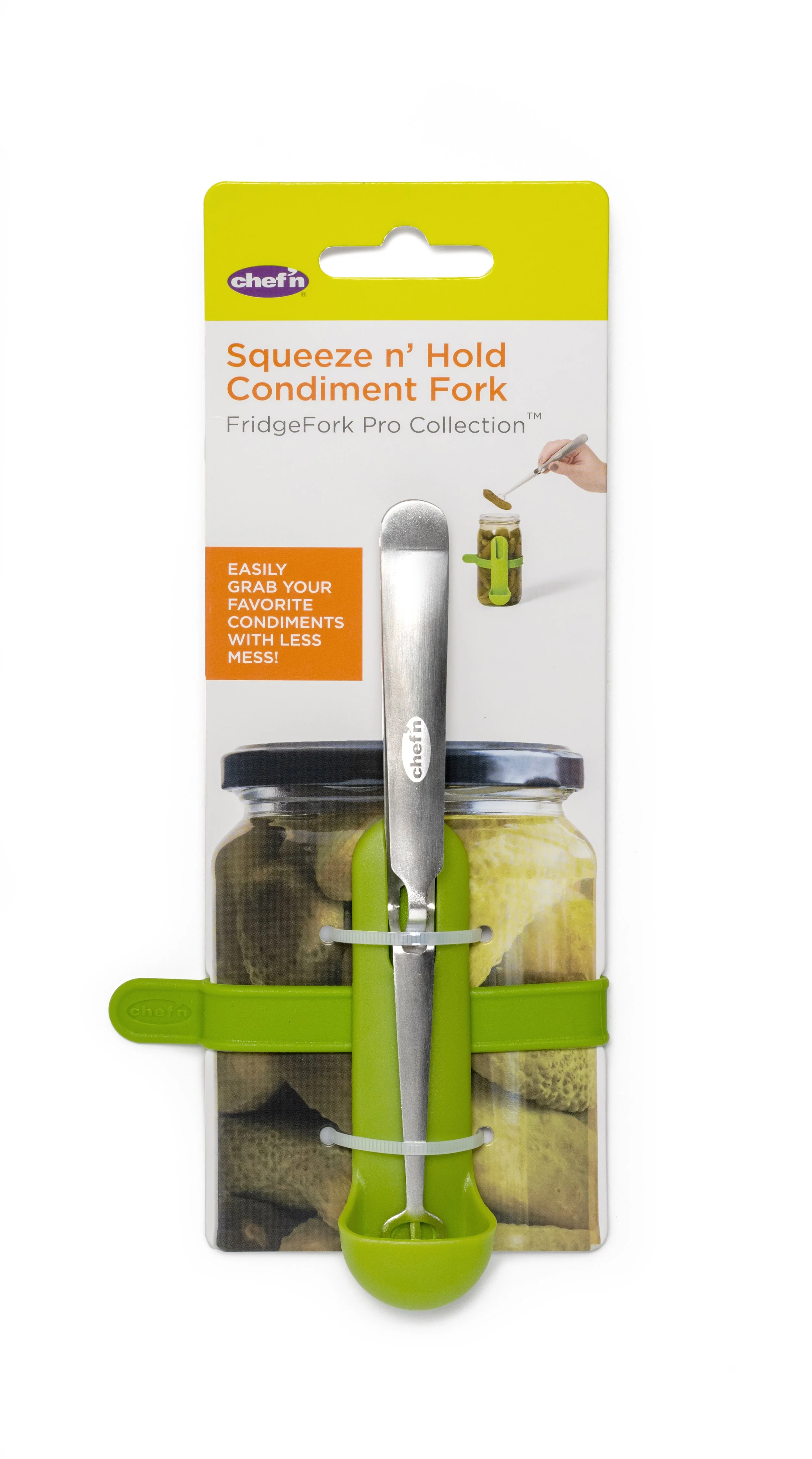
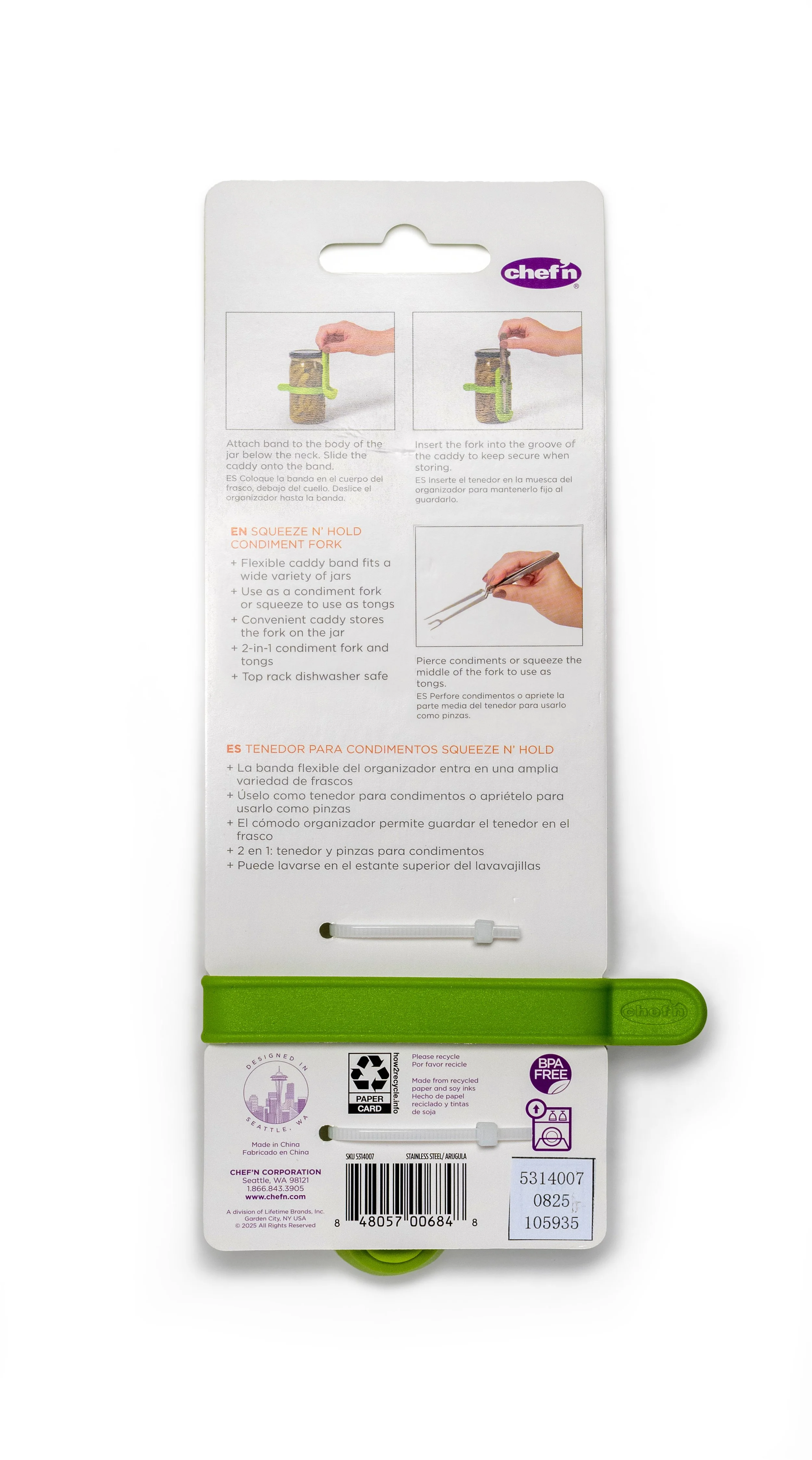
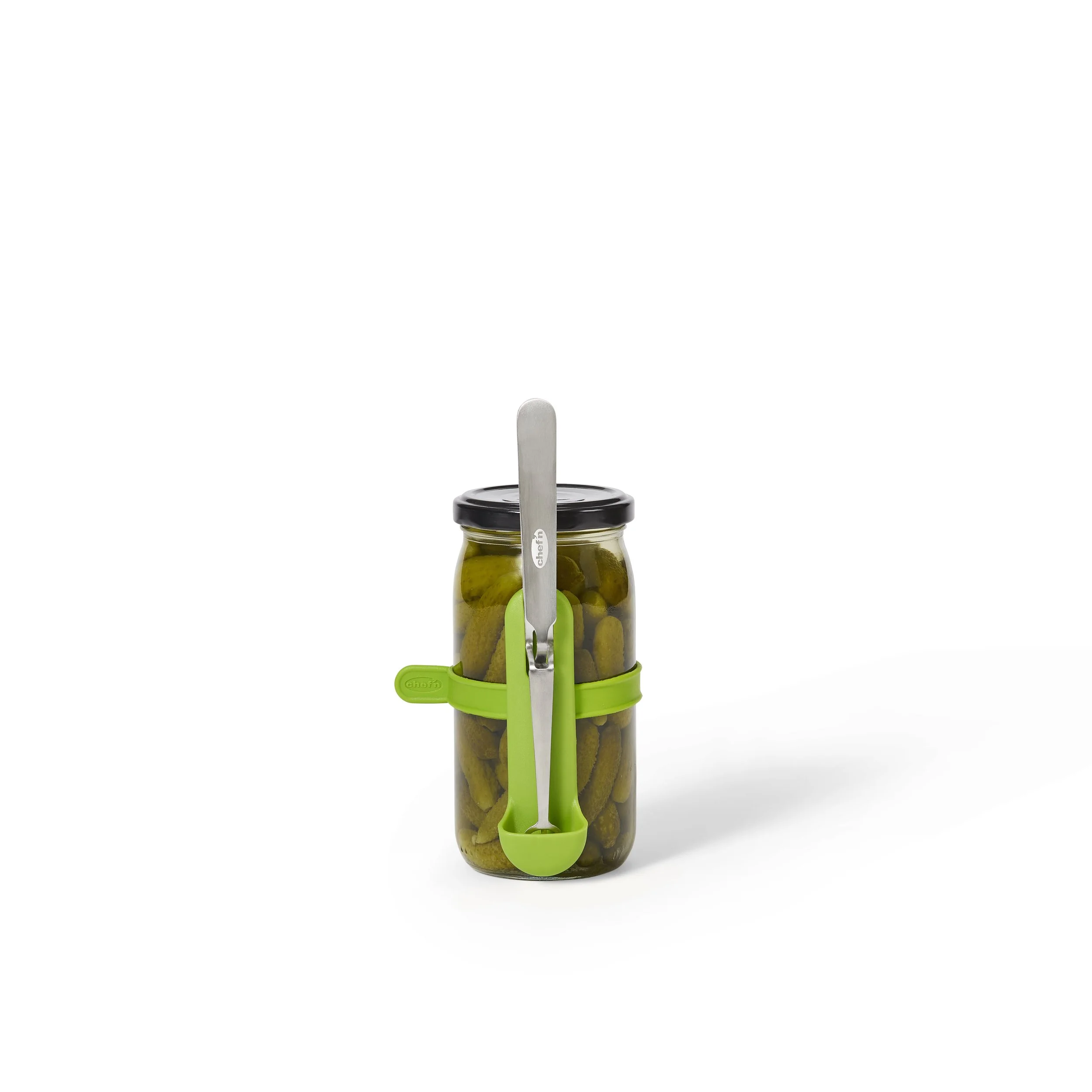
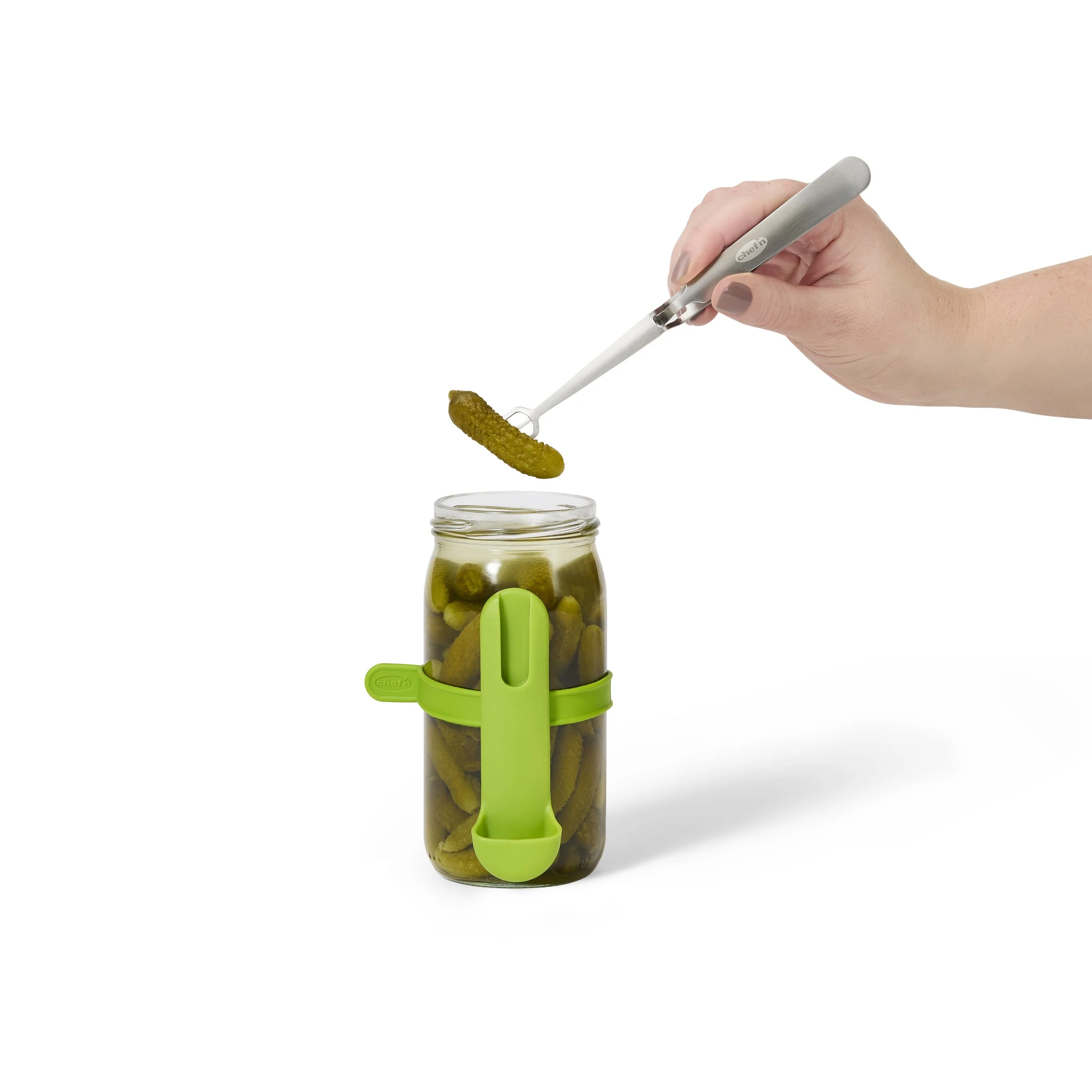
Squeeze n’ Hold Condiment Fork Product Images


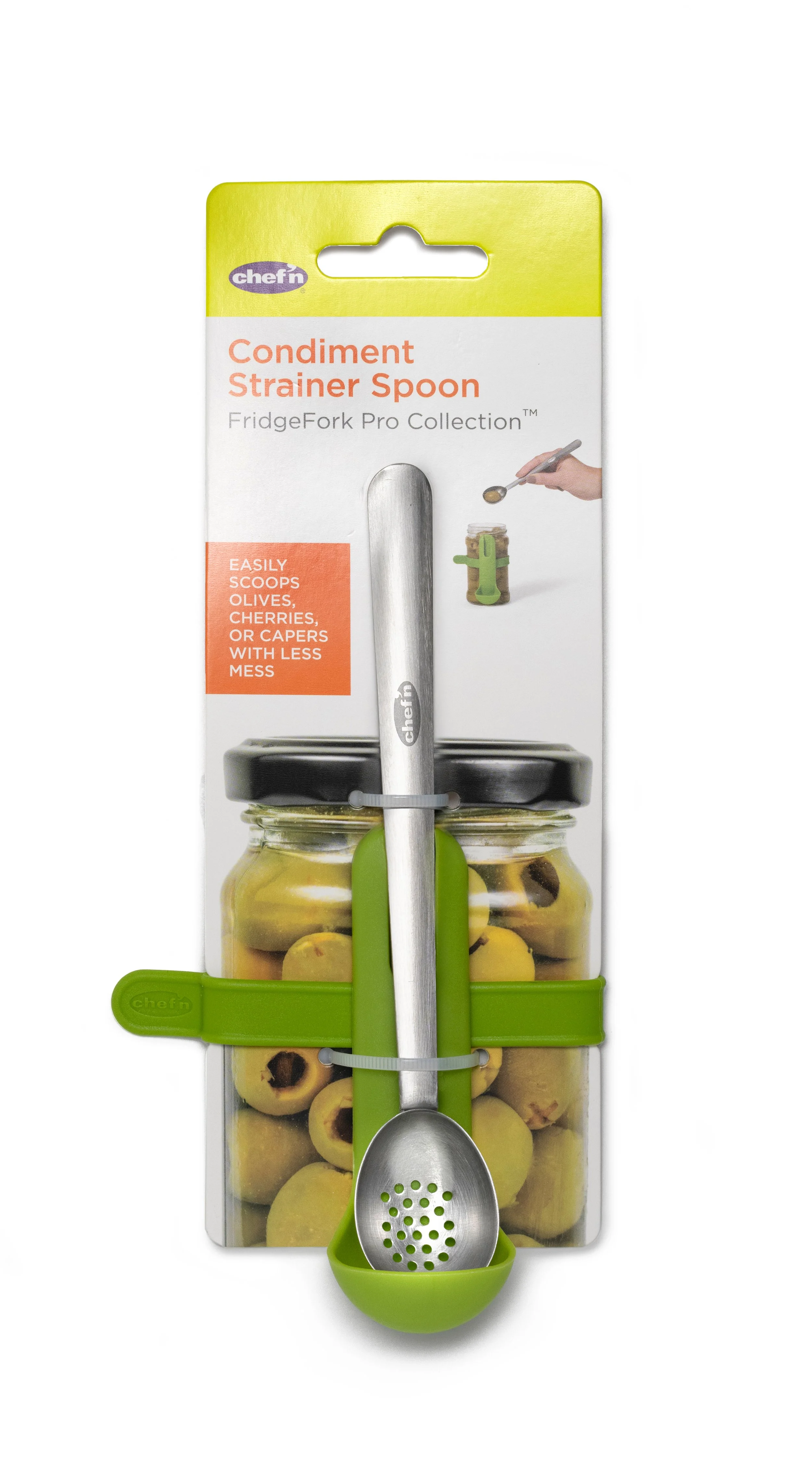
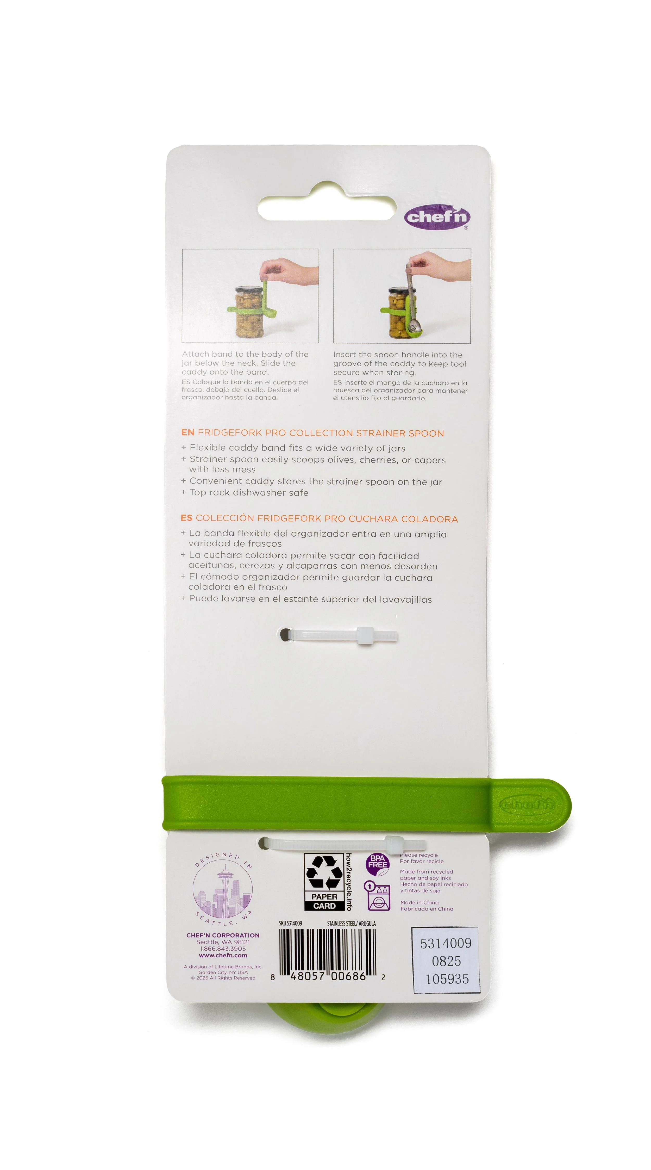
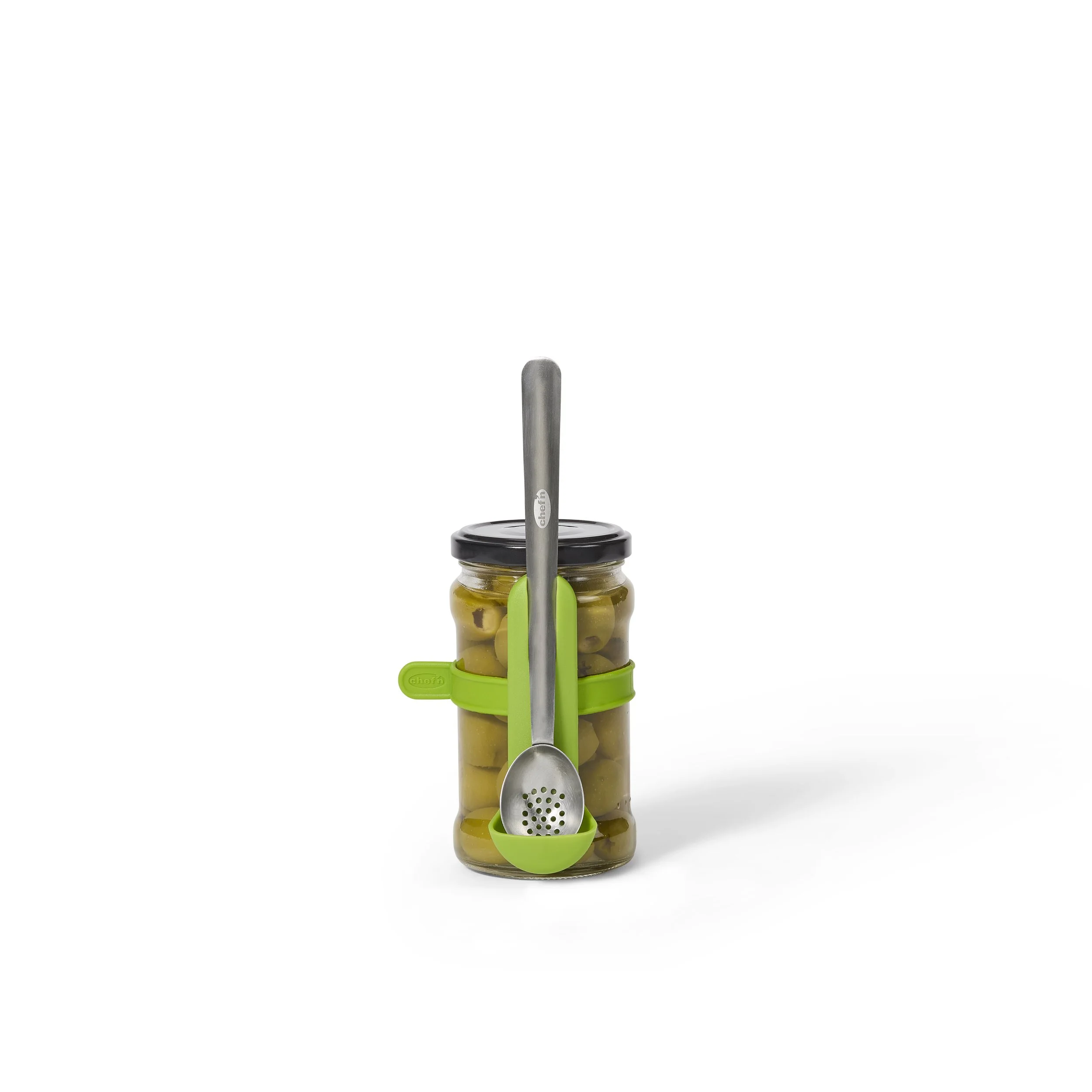
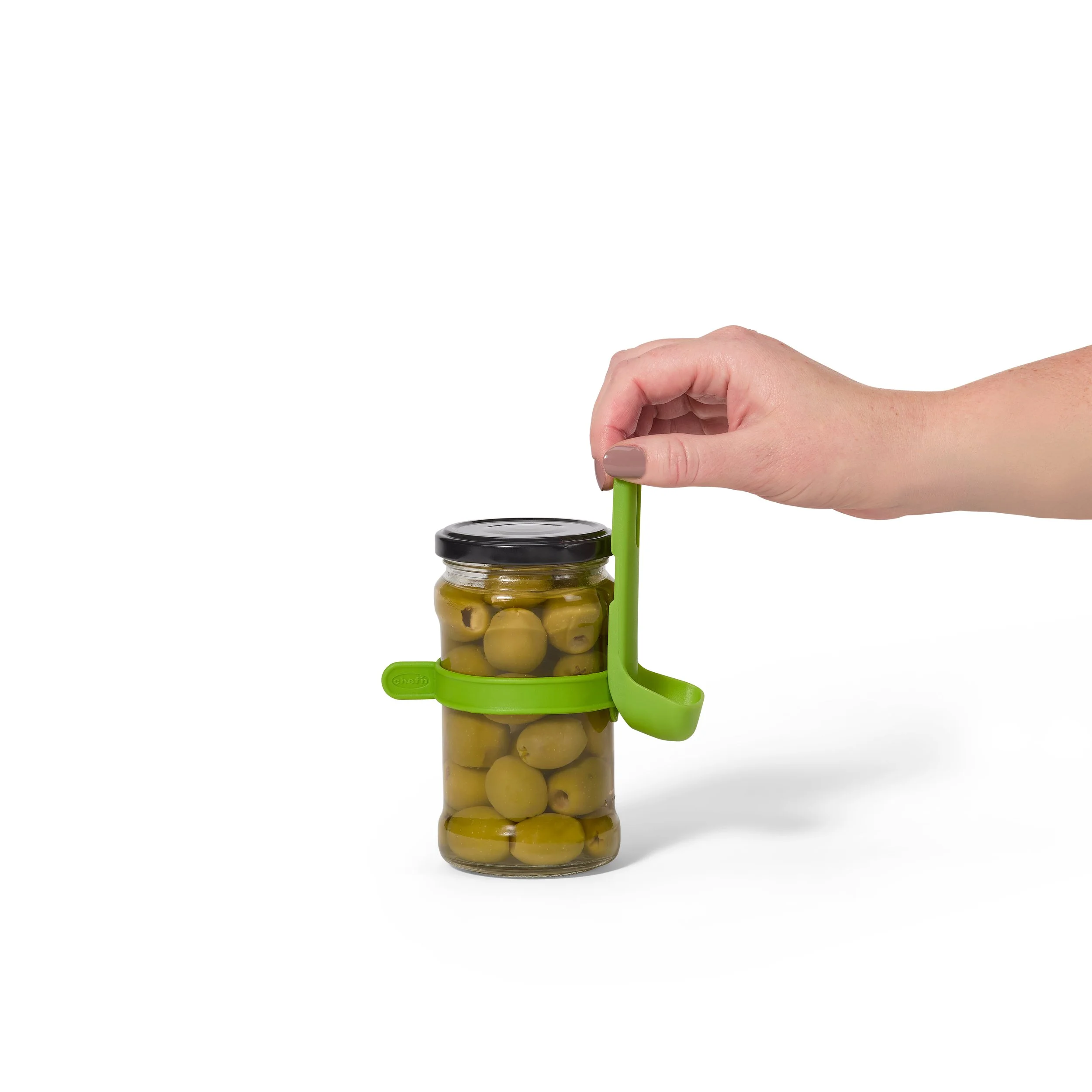
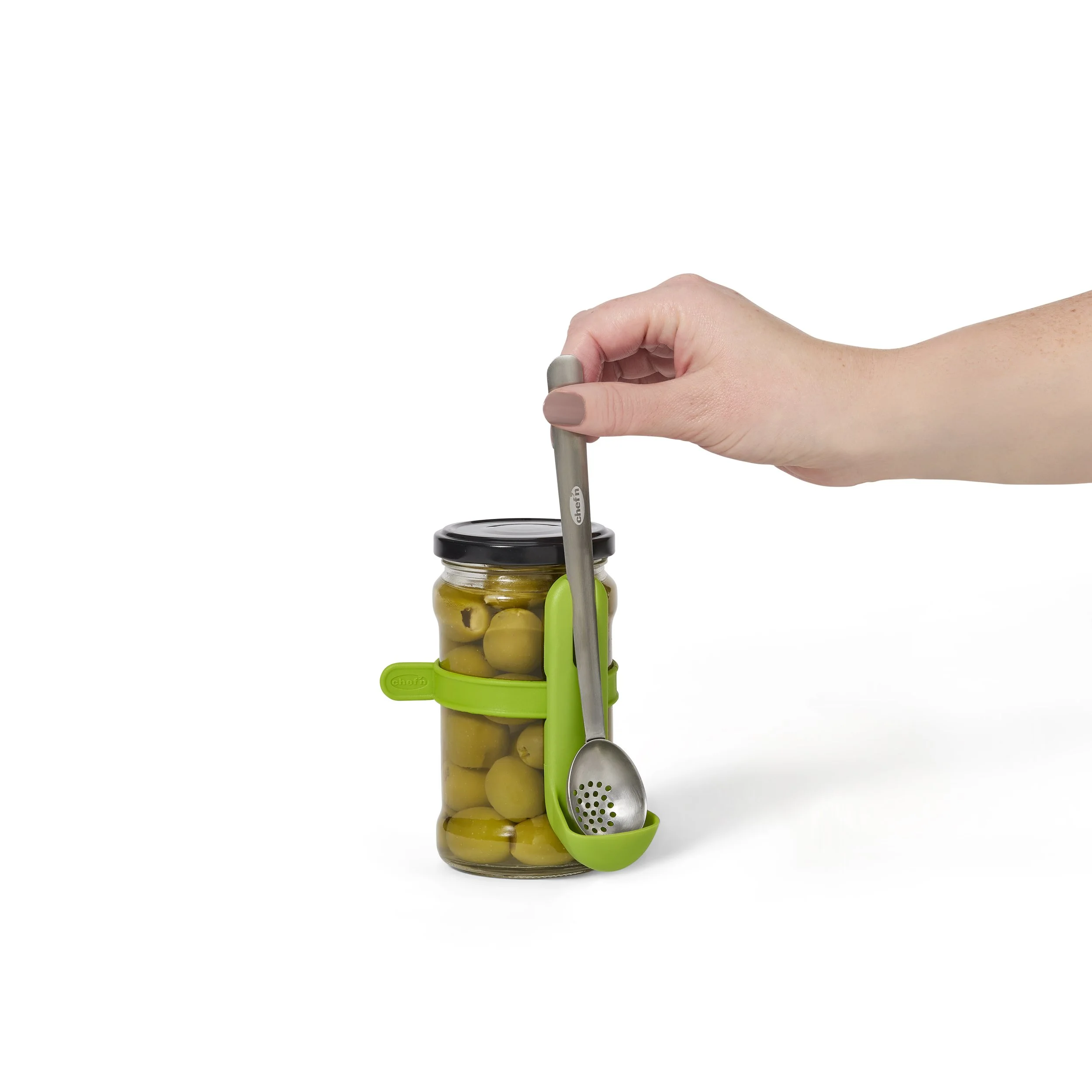
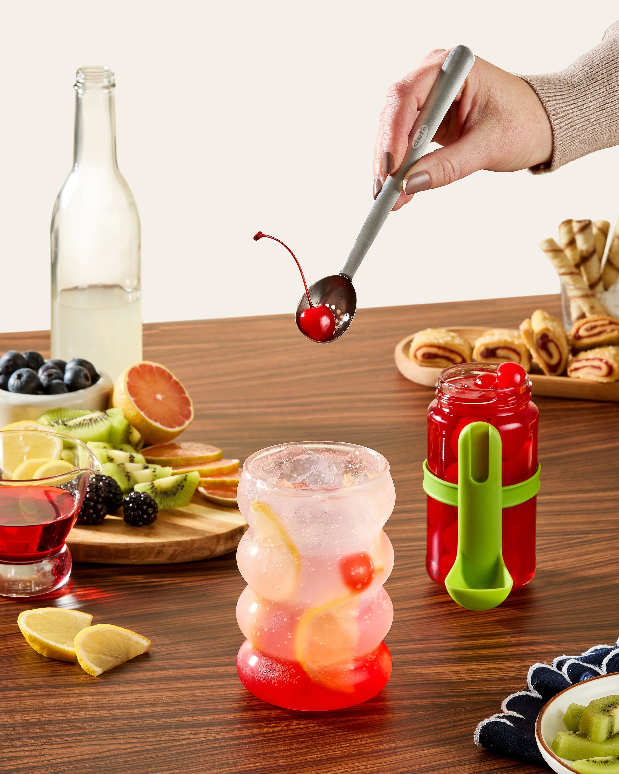
Condiment Strainer Spoon in Packaging
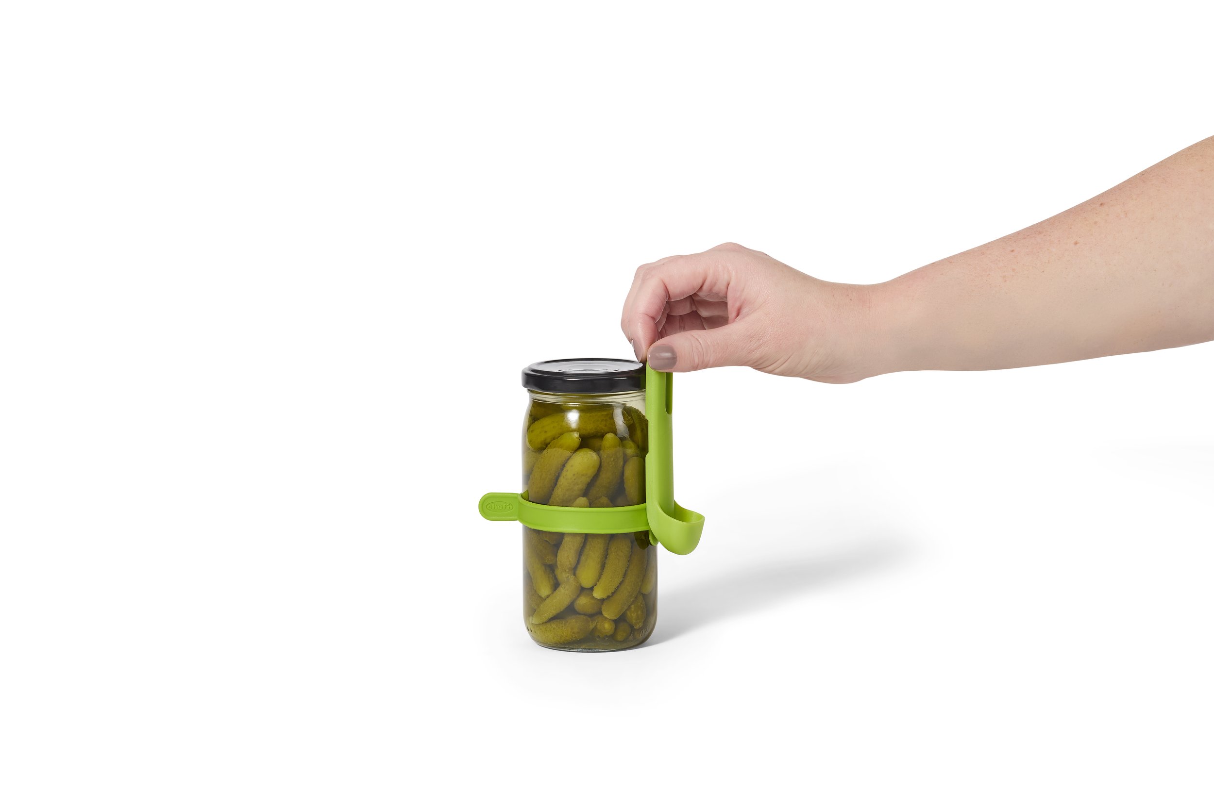
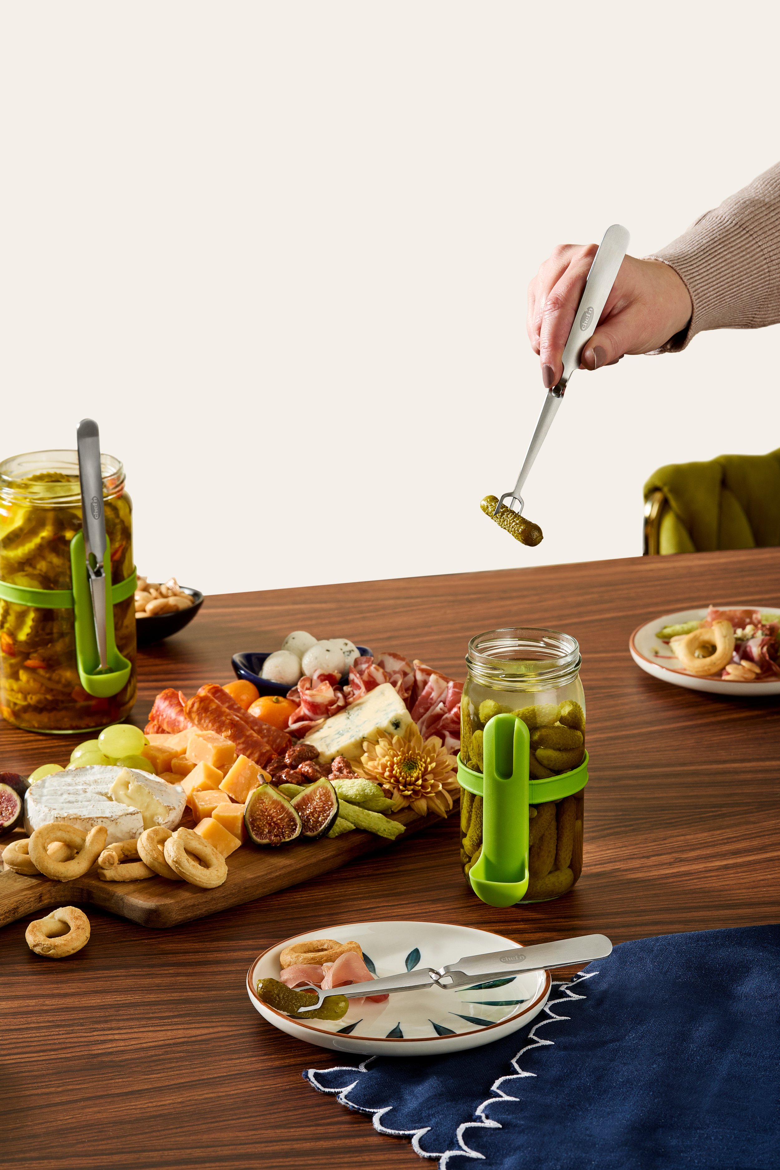
Condiment Strainer Spoon Product Photos

Corn Silkster & Peeler Nesting Corn Tool Set
Packaging
Packaging Photos


