
| PRODUCT PHOTOGRAPHY | Creative Direction
As the Art Director at BooginHead and Creative Director at Jewel Box Supply, I implemented new standards for product photography, increasing production efficiency, quality, and shorter timelines.
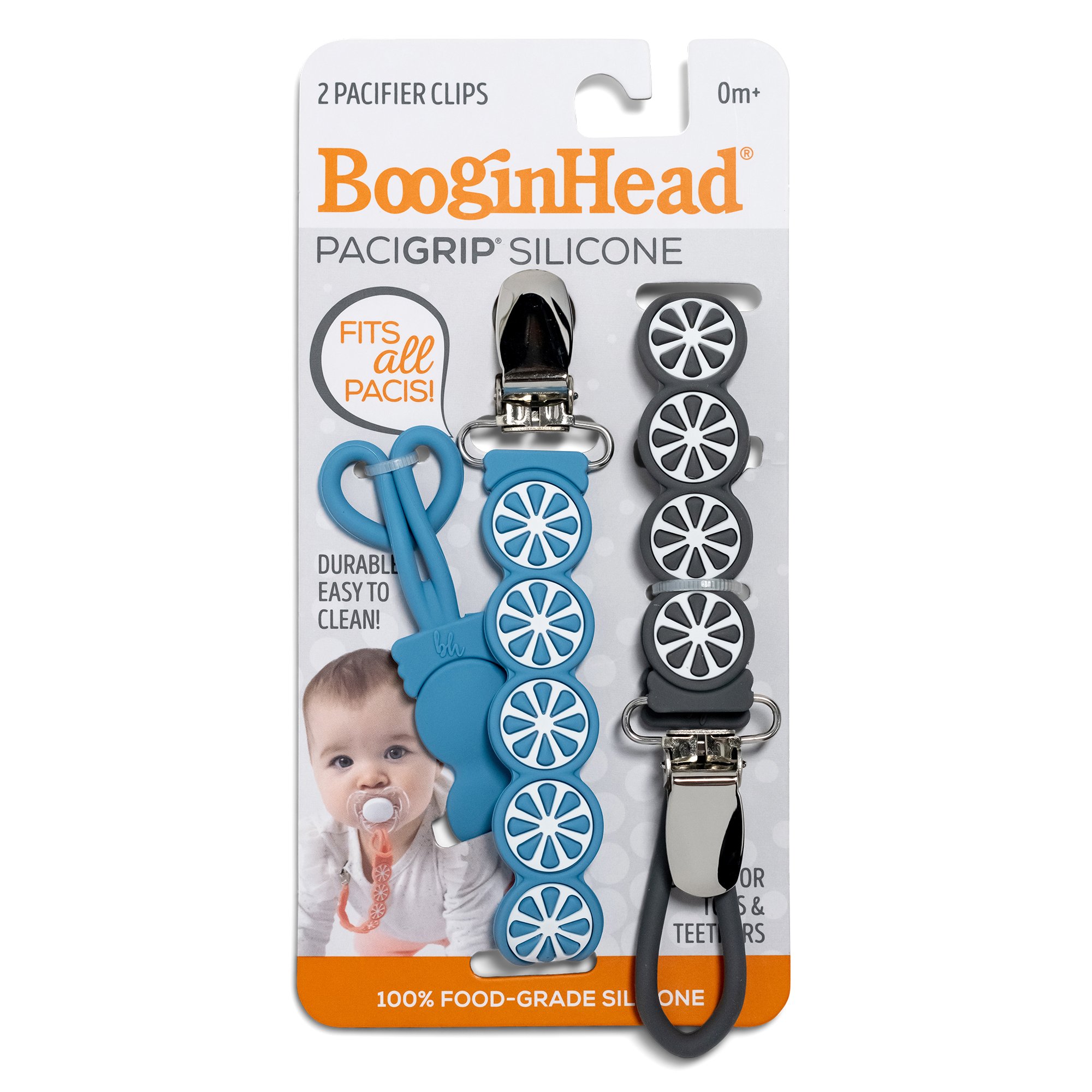
Product Photography BooginHead
CLIENT: BooginHead customer
ROLE: Art Director
DELIVERABLES: Cohesive product images, executed at various times when new product is available and processed on a short timeline.
PROCESS: Created a clear and easy to follow product photography style guide that allows any photographer to easily replicate image results with cohesive lighting. Created images are then cleaned up, removing dust, aligned to templates, and clipped to white with a natural shadow. Second processing for web assets, 2000 x 2000 72 dpi, are also created.
Product Images Prior Style Guide

Product photographed with a slight camera angle. Shadow intensity and shadow direction inconsistent from one shoot to another. Whites almost blown out and product blends into background. Loop not straight.
Product Images After Style Guide Rollout

Camera angle is straight down on product. Shadows are consistent and light direction is top right. White of product is separated from background and loop is straight.
Product Images Examples After Style Guide Rollout (please note that variations in orange packaging color is due to the different PMS colors used)


Lifestyle Product Images Examples


Product Photography Jewel Box
CLIENT: Jewel Box, customer facing website
ROLE: Creative Director
DELIVERABLES: Processed photography used to create a unified set of product tile images regardless of collection and the ability to execute this on a short timeline.
PROCESS: Tackling exposure and lighting first, I created a style guide with the ideal photography and lighting setup laid out. Then I went to work creating a series of templates in photoshop that would adjust any product color discrepancies and manipulate the product image into the same size and angle inside the frame. A universal shadow was also added to the template for a visually cohesive customer experience. This first template cut post production time in half. This was so successful I went on to create another set of templates to take the original product images and create working PNGs for web & social assets which eliminated a second photography shoot.
Product Images Prior Style Guide
Product tile images vary greatly from shoot to shoot. The size and angle of product in frame was not consistent, including photography lighting and post production editing creating an overall unprofessional customer experience.
Product Images After Style Guide Rollout
Consistent photography lighting setup and editing templates were created and implemented.
Product Images Prior Style Guide


Lighting varied from shoot to shoot creating inconsistent shadows. Exposure issues in general, especially with white product images being blow out/hot spots, and missing texture. Color not true to product, especially seen in reflective and glitter products (highlights are green). Original sizing method (with a quarter) was unprofessional looking.
Product Images After Style Guide Rollout


Lighting, shadows, and product color consistent. White balanced corrected (no hot spots), high level of texture/detail shown on product. Detail with sizing ruler overlay and watermark. Glitter highlights correct to actual product.